A Contemporary Approach to Web Building: How I Used Cursor to Rebuild My Portfolio
A meta case study on designing, developing, and launching my own portfolio as a demonstration of modern web skills, design systems, and technical fluency.
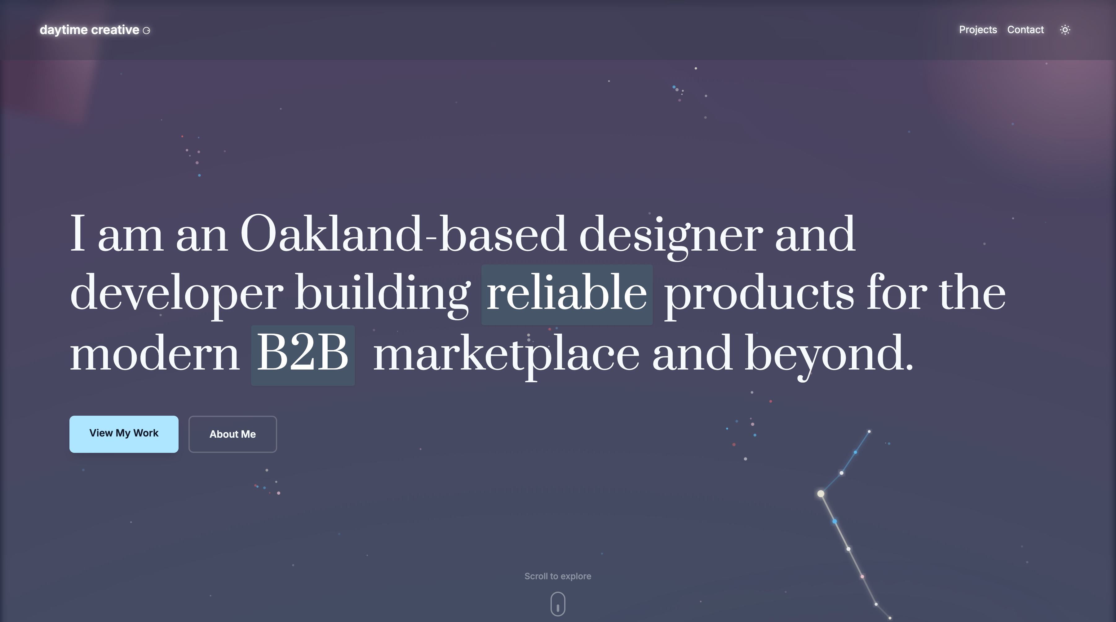
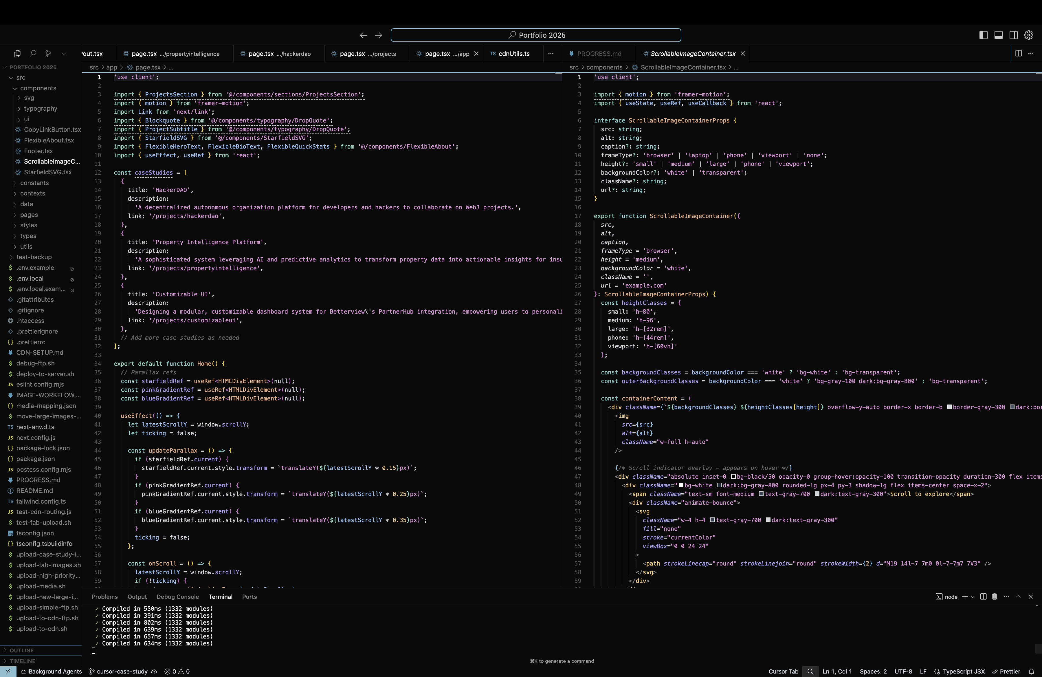
Drag the slider to compare development environment and final result
Why Rebuild? (Motivation & Goals)
After years of relying on Squarespace for my portfolio, I realized it was time for a change. The old site was easy to maintain, but it didn't reflect my current skills or the way I actually work. I wanted a portfolio that wasn't just a gallery of past projects, but a living demonstration of my technical fluency, design process, and ability to build with today's best tools.
But the real driver was personal. After a break from tech—working in art fabrication, taking on design gigs, and navigating some big life changes—I needed to prove to myself that my skills weren't just intact, but sharper than ever. This project is both a bridge across my career gap and a statement: I can actually deliver results with the latest stack.
"I wanted a portfolio that's a living demonstration, not just a gallery."
The problem? Squarespace is perfect for quick, no-code sites, but it's not built for the kind of experimentation and customization I wanted. The templates are beautiful, but you can always spot a Squarespace site. Custom code is possible, but it's more workaround than workflow. And building a living style guide or reusable components? That's not what Squarespace is made for.
That's not a criticism—Squarespace is excellent at what it does. But I needed something that would let me tinker, experiment, and build the kind of interactive, dynamic portfolio that actually demonstrates my current capabilities.
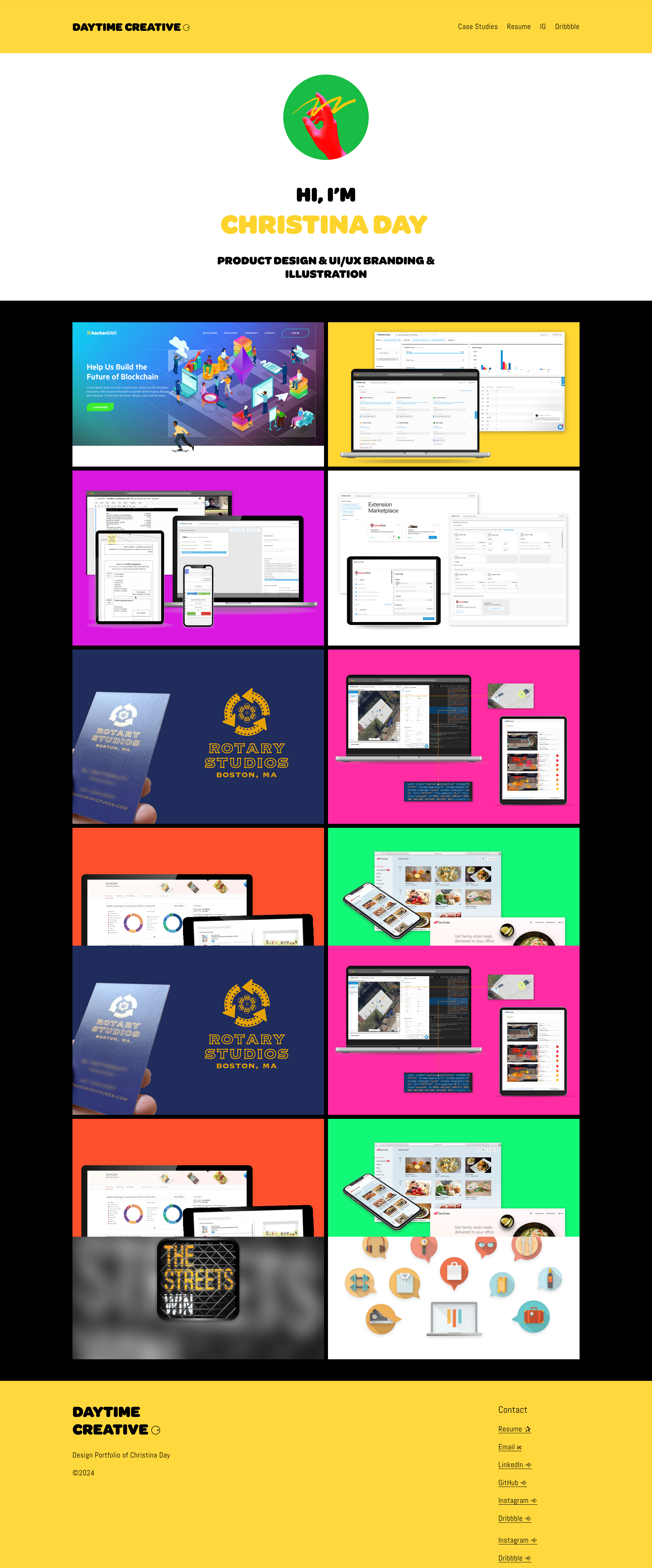
A screenshot of my previous Squarespace portfolio. • Scroll to explore the full interface
Issues with Squarespace limitations
- Clean, but the same homepage as a thousand others.
- Custom ideas? Usually met with "not supported."
- Great for non-developers; too tidy for code-driven work.
Case studies, but stuck in a template
- Every project story started to sound the same. That's the tradeoff for consistency.
- Breaking the grid or adding custom layouts? Not really an option.
- Consistent, but the personality was a little muted.
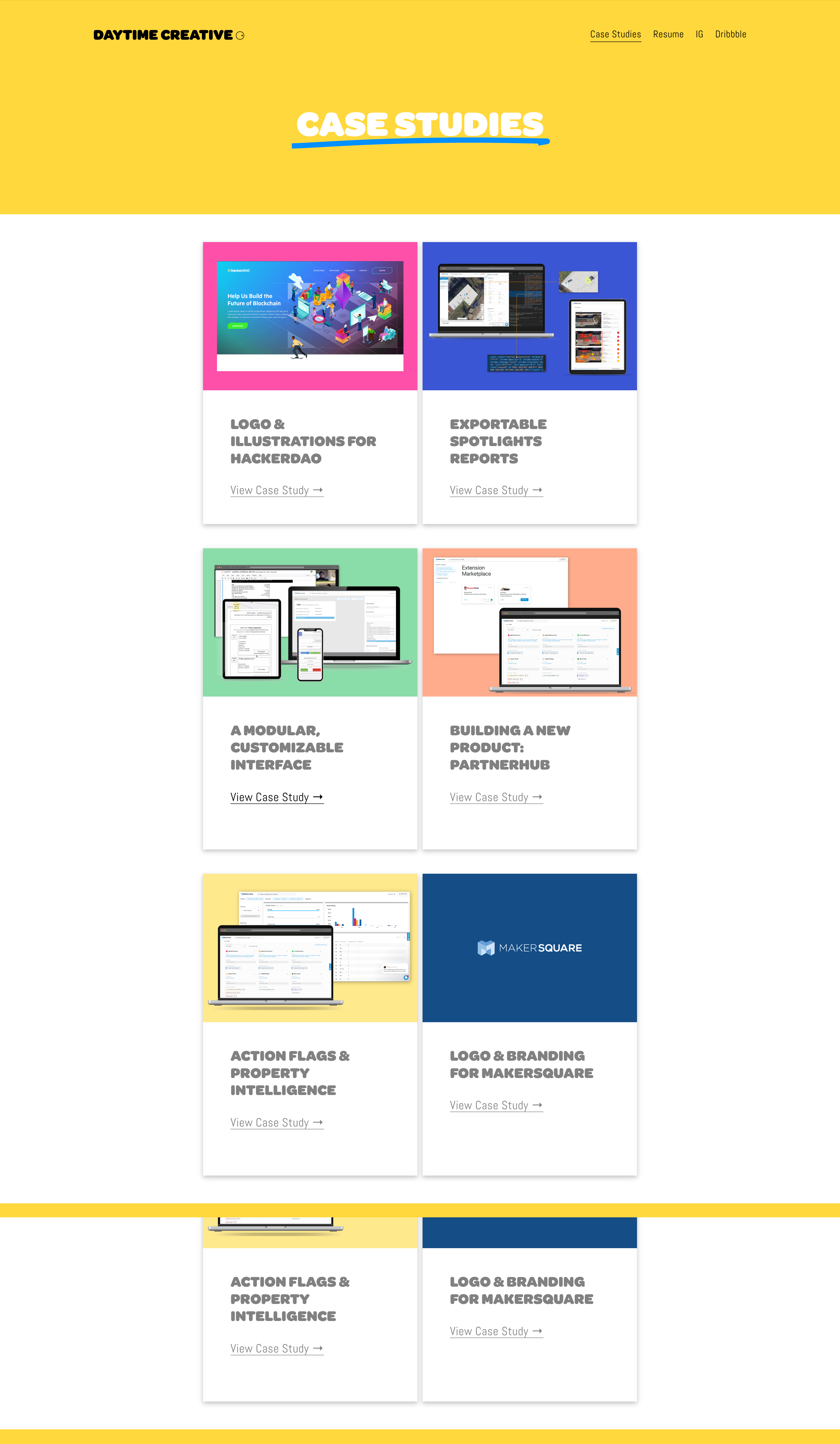
A screenshot of the case studies section from my previous Squarespace portfolio. • Scroll to explore the full interface

A screenshot of a case study from my previous Squarespace portfolio. • Scroll to explore the full interface
Project pages: stuck in the box
- Project pages were always a remix of the same blocks.
- Technical depth or custom visuals? Only if "custom" means "sort of like everyone else."
- Scrollability or interactivity? Not really. For many, that's a feature, not a bug.
Design & Tech Stack Choices
Choosing the right stack wasn't just about using the latest tools. I needed a foundation that would let me move fast, experiment, and actually document my process as I went. This portfolio isn't a static gallery—it's a living demonstration of how I work, how I solve problems, and how I approach design systems in the real world.
Every decision here was made to support rapid iteration, honest documentation, and the kind of workflow I'd use on a real product team. The stack below is what enables that: tools that are proven, flexible, and built for real-world results—not just to look good on a portfolio site.
Tech Stack
This isn't just a list of trendy tools. Every choice here supports the way I actually work: rapid prototyping, real design system thinking, and documenting every pattern as I go. The stack below is what lets this portfolio be a living demonstration, not just a static gallery.
Next.js
File-based routing, hybrid rendering, and Vercel integration—lets me ship fast and focus on building.
React
Component-driven UI, huge ecosystem, and the best way to build interactive sites in 2025.
Tailwind CSS
Utility-first, design in markup, iterate fast, and keep everything consistent.
Framer Motion
Modern, smooth animation for React—declarative, powerful, and easy to use.
Vercel
Fast, reliable deployments, instant previews, and zero-config—lets me focus on building, not DevOps.
The Living Style Guide
Most style guides are static documents or Figma files that quickly fall out of sync with the real product. I wanted something different—a living style guide, built directly into the site, that documents every pattern, component, and decision as it actually exists in production.
This approach lets me move fast, experiment safely, and keep the design system honest. The style guide isn't just a reference—it's a toolkit I use every day, evolving alongside the project and making it easy to onboard, iterate, and maintain consistency as the site grows.
Typography & Design Patterns
Typography Preview
Light Mode
Font Families
Typography Examples
Typography Preview
Dark Mode
Font Families
Typography Examples
Color Palette & UI Components
Color Palette
Light Mode
Buttons
Card Pattern
Info Card
This is a sample card pattern. Use for features, highlights, or structured info.
Color Palette
Dark Mode
Buttons
Card Pattern
Info Card
This is a sample card pattern. Use for features, highlights, or structured info.
Beyond the Style Guide: Project Rules & Documentation
The style guide wasn't just a visual reference—it was part of a larger documentation system. I paired it with markdown files that contained project rules, naming conventions, and workflow guidelines. This dual approach meant I had both visual patterns and written guidelines that evolved together.
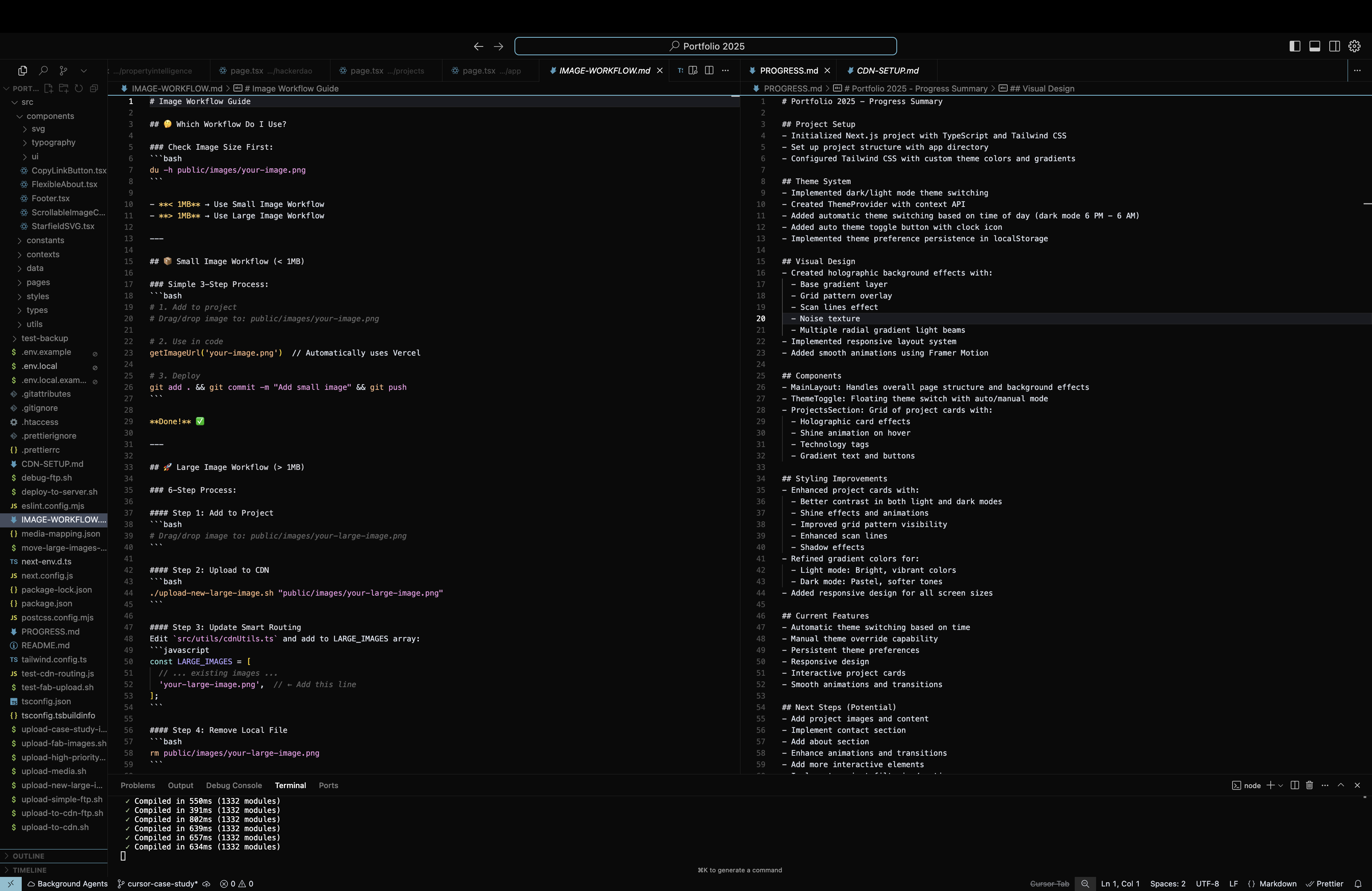
A screenshot showing the markdown files used for project rules, naming conventions, and workflow guidelines. • Scroll to explore the full interface
Style Guide (Visual)
- Live component examples with real code
- Typography hierarchy and spacing
- Color palette with hex values
- Button states and interactions
- Card patterns and layouts
Project Rules (Markdown)
- Naming conventions for files and components
- Layout patterns and when to use them
- Image workflow and optimization rules
- Git commit message standards
- Onboarding notes for future contributors
This system kept everything consistent and made it easy to onboard new contributors (including myself after breaks). Whenever I solved a new problem or found a better approach, I'd update both the visual style guide and the written rules—keeping everything in sync and honest about what actually works in production.
How the Style Guide Actually Works
The style guide and project rules I built weren't just documentation—they were the foundation of my actual workflow. I developed two distinct modes that let me move fast while maintaining quality: "get shit done mode" for rapid deployment using proven patterns, and "experimentation mode" for solving novel challenges and evolving the system.
This dual approach meant I could ship quickly when I knew exactly what I needed to build, but also had the flexibility to innovate when I hit content that didn't fit existing patterns. Every new solution that worked got documented and added to the style guide, so the system evolved with the project.
Get Sh*t Done Mode
When I knew exactly what I needed to build, I'd use pre-approved components from the style guide. This was my default mode—fast, consistent, and reliable.
- Reuse proven layout patterns
- Apply established color and typography rules
- Deploy content quickly with confidence
- Maintain consistency across the site
Experimentation Mode
When I hit content that didn't fit existing patterns, I'd switch to experimentation mode. This was where the style guide evolved and grew.
- Try new patterns and approaches
- Document successful solutions
- Update both style guide and project rules
- Evolve the system based on real needs
A Real Example: The Timeline Component
When I needed to show my learning journey in the case study, I started in "get shit done mode" with existing card patterns. But the content didn't fit well—it needed a timeline layout. So I switched to "experimentation mode," built a custom timeline component, and then documented it in the style guide for future use.
This is how the system actually works: it's not just about following rules, but about knowing when to break them and how to evolve the rules based on real needs.
Image Workflow: Supporting Both Modes
The image workflow I built had to support both workflow modes seamlessly. In "get shit done mode," I needed a system that was fast and predictable—drop an image in the right folder, use the standard component, and it just works. In "experimentation mode," I needed the flexibility to try new approaches while maintaining the same performance and organization standards.
This meant creating a workflow that was both systematic and flexible. Every image follows the same basic patterns, but the system can handle everything from quick screenshots to complex multi-image layouts. The result is a system that scales with the project and keeps the codebase clean.
Images in "Get Sh*t Done" Mode
For standard images, I follow the established patterns: organized storage, consistent implementation, and automatic optimization.
- Drop image in
/public/images/ - Use Next.js Image component with standard props
- Apply consistent styling (borders, shadows, radius)
- Let the system handle optimization automatically
Images in "Experimentation" Mode
For complex image layouts or new patterns, I experiment while maintaining the same organizational standards.
- Try new layout patterns (grids, carousels, overlays)
- Experiment with advanced interactions
- Document successful patterns for future use
- Maintain performance and accessibility standards
The System in Action
The workflow wasn't just theoretical—it was built into the codebase itself. Every image follows the same patterns: organized storage, consistent implementation, and performance optimization built right into the components.
This systematic approach meant I could focus on building features rather than managing assets, while still maintaining professional quality and performance standards.
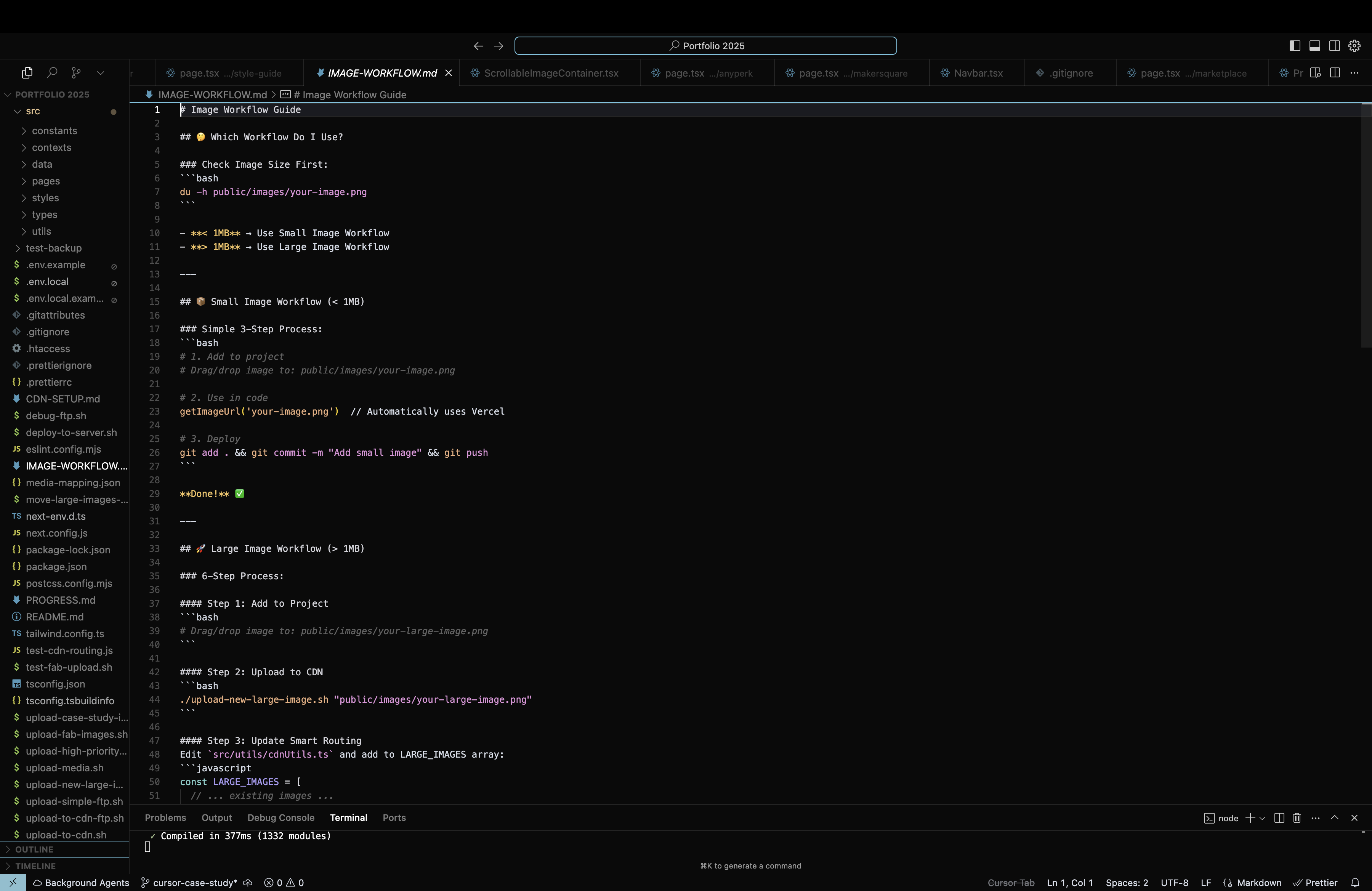
Smart Image Routing
The system automatically routes images based on size: small images stay on Vercel for speed, while larger images get uploaded to my hosting.com CDN to keep deployment sizes manageable. The getImageUrl() function handles all the routing logic seamlessly.
- Stored in
/public/images/ - Served directly from Vercel
- Fast local development
- Cursor manages uploads via Vercel
- Uploaded to hosting.com CDN
- Added to
LARGE_IMAGESarray - Removed from local storage
- Cursor manages uploads via FTP
Cursor's Role in the Workflow
Cursor isn't just my code editor—it's an active participant in this image workflow. It automatically manages uploads based on image size, using Vercel's deployment pipeline for smaller assets and FTP for larger files that need to be sent to external servers.
- Small images deployed with code
- Automatic optimization
- Instant previews
- Zero configuration
- Large images sent to external CDN
- Automated upload scripts
- Keeps deployment sizes small
- Maintains performance
"A good image workflow isn't just about storing files—it's about creating a system that supports how you actually work."
This workflow ensured that images were properly organized, optimized, and maintainable throughout the project lifecycle. It supported both development speed and production quality, making it easy to iterate quickly while maintaining professional standards. The result was a system that scaled with the project and kept the codebase clean and performant.
Innovations That Emerged from Experimentation
The best innovations in this project came from "experimentation mode"—when I hit content challenges that didn't fit existing patterns. Instead of forcing square pegs into round holes, I built custom solutions that solved real problems and then documented them for future use.
These aren't just technical tricks—they're proof that I can design and build systems that actually work for real users. Every innovation started as a problem that needed solving, evolved through experimentation, and ended up as a documented pattern in the style guide.
How Innovations Emerged
- Content didn't fit existing patterns
- User experience needed improvement
- Performance or accessibility gaps
- Try new approaches and patterns
- Test in real context
- Iterate based on results
- Add to style guide
- Update project rules
- Make reusable for future
Live Demo: Homepage Hero Title
Designer & Developer for B2BB2B Companies
Building digital products that actually work.
CyclingText: A Real Problem, Real Solution
Problem: I needed a hero title that could adapt to different audiences without creating multiple pages.
Solution: Built a custom CyclingText component that cycles through different company types with smooth animations and accessibility features.
Result: One hero title that works for multiple audiences, with the pattern documented for future use.
Live Demo: Animated SVG Graphics
Interactive Starfield Animations
Problem: The homepage hero needed visual interest that matched the space theme without being distracting.
Solution: Custom SVG animations with the Scorpio constellation, shooting stars, and satellite movements that enhance rather than compete with the content.
Constellation
Pulsating connecting lines and glowing stars
Shooting Star
Animated comet with gradient tail
Satellite
Small orbiting dot with pulsing signal
Live Demo: Theme Switching
Light Mode / Dark Mode
Interactive theme switching with automatic system preference detection and manual toggle controls.
Theme Preview
Designer & Developer for B2B Companies
Building digital products that actually work.
Project Card
Clean typography with subtle borders
Creative Technical Solutions
Atmospheric Background Elements
Custom gradient clouds, nebula effects, and parallax animations that create depth without overwhelming content.
Gradient Clouds
Custom CSS gradients with blur effects and mix-blend-mode to create atmospheric depth. Each cloud uses radial gradients with carefully tuned opacity and positioning.
Nebula Effects
Inspired by the Horsehead Nebula, these effects use multiple layered gradients with different blend modes to create cosmic depth and movement.
Starfield Animation
Dynamic SVG starfield with twinkling stars, shooting stars, and the Scorpio constellation. Each star has unique animation timing and opacity patterns.
Parallax System
Custom scroll-based animation system using requestAnimationFrame for smooth 60fps performance. Each element moves at different speeds to create depth.
Parallax Layers
Multiple gradient layers moving at different scroll speeds to create depth. Each layer uses transform3d for hardware acceleration.
Performance Optimizations
Every background element is optimized for performance with will-change properties, passive event listeners, and efficient CSS transforms.
Technical Implementation
The background system uses a combination of CSS gradients, SVG filters, and JavaScript scroll handling. Each element is positioned absolutely with different z-index layers, and the parallax effect is achieved through transform3d for hardware acceleration. The system automatically adapts to light/dark mode with different gradient sets.
Challenges & How the Workflow Helped
Coming back to modern frameworks after a break was humbling—there's always something new to learn, and the pace of change in web development doesn't slow down for anyone. But having the workflow modes I established made all the difference. When I hit roadblocks, I could switch to "experimentation mode" to figure things out, then document the solutions for future "get shit done mode" use.
The biggest challenge was fighting the urge to make everything perfect before shipping. The workflow helped me focus on getting real, working solutions out the door first, then improving them. Documenting as I went was harder than expected, but it paid off—every solution I figured out became part of the system for next time.
Challenge: Modern Framework Learning Curve
Problem: Coming back to modern React/Next.js after a break meant learning new patterns, hooks, and best practices.
Workflow Solution: Used "experimentation mode" to try different approaches, then documented successful patterns in the style guide for future "get shit done mode" use.
Result: Built a library of proven patterns that made subsequent development much faster.
Challenge: Perfectionism vs. Shipping
Problem: Wanted to make everything perfect before shipping, which slowed down progress and killed momentum.
Workflow Solution: Used "get shit done mode" to ship working solutions quickly, then "experimentation mode" to iterate and improve based on real feedback.
Result: Shipped faster, learned more from real usage, and built better solutions through iteration.
Challenge: Documentation Discipline
Problem: Documenting as I went was harder than expected—easy to skip when focused on building.
Workflow Solution: Made documentation part of the workflow—every "experimentation mode" solution had to be documented before it could be used in "get shit done mode."
Result: Built a comprehensive style guide and project rules that made onboarding (even for myself) much easier.
Challenge: Content That Didn't Fit Patterns
Problem: Some content (like the timeline, complex image layouts) didn't fit existing patterns and needed custom solutions.
Workflow Solution: Used "experimentation mode" to build custom components, then documented them as new patterns for future use.
Result: Created innovative solutions that became part of the design system and improved the overall site quality.
The Key Lesson: Confidence Comes from Doing
The biggest lesson from this project? Confidence comes from doing the work, not just planning it. The workflow I built helped me move from "I should know this" to "I can figure this out" to "I know how to solve this."
Every challenge became an opportunity to improve the system. Every solution became part of the toolkit. The result is a portfolio that's not just a showcase of finished work, but a living record of my ability to adapt, learn, and deliver at a high level.
Process & Discovery Timeline
This timeline shows how the project evolved through discovery and experimentation. Each step involved exploring new approaches, testing ideas, and refining the system based on what was learned.
Framework Discovery
Relearning Next.js and React patterns after the break. Discovering what had changed and what new approaches were available.
Workflow Foundation
Setting up the development environment and establishing the dual-mode workflow approach that would guide the entire project.
Design System Discovery
Exploring color palettes, typography scales, and discovering what patterns would work best for the content I had in mind.
Component Exploration
Building and testing reusable components, discovering which patterns were most effective and which needed iteration.
Layout Experimentation
Trying different navigation and layout approaches, discovering what worked best for the content structure.
Content Discovery
Exploring how to tell the story of each case study, discovering the right narrative structure and content strategy.
Process Documentation
Documenting the design and development process as it unfolded, discovering what was worth preserving for future use.
Interactive Discovery
Exploring animations, demos, and interactive elements to discover what would best showcase the technical approach.
Performance Discovery
Discovering the right image optimization and loading strategies for the specific content and user experience goals.
System Refinement
Discovering edge cases, optimizing the workflow, and refining the entire system based on real usage and feedback.
What This Project Actually Demonstrates
This project isn't about proving I can code—it's about showing how I think about problems, how I approach design systems, and how I build things that actually work. The workflow I developed, the innovations I created, and the challenges I solved all demonstrate real-world problem-solving skills that translate to any project.
The most valuable insight? Seeing how much the ecosystem has evolved, and how much better the developer experience has gotten. These tools make it possible to ship faster, iterate more confidently, and focus on the actual problems instead of fighting the framework. That's the kind of environment where real innovation happens.
Design System Thinking
Built a living style guide that evolves with the project, not just static documentation. Shows I understand how to create systems that scale and adapt.
- Visual patterns that work in production
- Written rules that guide development
- Documentation that stays in sync
Workflow Optimization
Developed a dual-mode approach that balances speed with quality. Shows I can create systems that support both rapid deployment and thoughtful innovation.
- "Get shit done" mode for proven patterns
- "Experimentation" mode for novel challenges
- Documentation that bridges both approaches
Real-World Problem Solving
Every challenge became an opportunity to improve the system. Shows I can adapt, learn quickly, and turn obstacles into advantages.
- Modern framework learning curve
- Perfectionism vs. shipping trade-offs
- Content that didn't fit existing patterns
Technical Innovation
Created custom solutions that solve real problems. Shows I can build things that don't exist yet and make them work in production.
- CyclingText component for dynamic content
- Custom SVG animations for visual interest
- Smart image routing system
Cutting-Edge Development Workflow
This portfolio was built using Model Context Protocol (MCP) tools that represent the future of AI-assisted development. These tools enabled rapid iteration, sophisticated problem-solving, and a development experience that feels like pair programming with an expert.
MCP Tools Used
- •Context7: Real-time documentation access for libraries and frameworks
- •Puppeteer: Automated browser testing and visual validation
- •Sequential Thinking: Complex problem breakdown and solution planning
- •File Operations: Intelligent code editing and refactoring
Development Benefits
- •Rapid Prototyping: Ideas to working code in minutes
- •Intelligent Debugging: Complex issues solved systematically
- •Documentation Integration: Always up-to-date with latest APIs
- •Visual Validation: Automated testing of complex animations
Why This Matters
Using MCPs isn't just about faster development—it's about building better software. These tools enable a development workflow where complex problems are broken down systematically, solutions are validated visually, and documentation is always current. This represents the future of AI-assisted development, where human creativity is amplified by intelligent tools rather than replaced by them.
What's Next: Applying This Approach
This project demonstrates the kind of thinking and approach I bring to every project. I'm excited to apply this same systematic, adaptive approach to bigger challenges and more complex problems.
Collaborate & Contribute
Excited to work with talented teams and ship meaningful products using this systematic approach.
Build Ambitious Products
Ready to tackle bigger challenges and ship real value with the same workflow optimization mindset.
Mentor & Support
Looking forward to helping others develop their own systematic approaches to problem-solving.