Customizable Dashboards & Betterview Insight Reporting
Designing a modular, customizable dashboard system for Betterview's PartnerHub integration, empowering users to personalize their data visualization experience.
Overview
The introduction of PartnerHub to the Betterview platform brought an unprecedented influx of new data points, necessitating a more adaptable and user-centric dashboard. Recognizing the potential for data overload and the varied needs of our clients, the challenge was to design a Customizable UI that would allow users to not only manage the complexity but also to personalize their data visualization experience.
As a UX/Product Designer, my role was to lead the creation of a modular, customizable dashboard system that empowers clients to curate and prioritize data according to their unique operational needs.
My Contribution
- UX Design
- Product Design
- User Research
The Team
- 1x Product Manager
- 4x Engineers
- 1x Designer
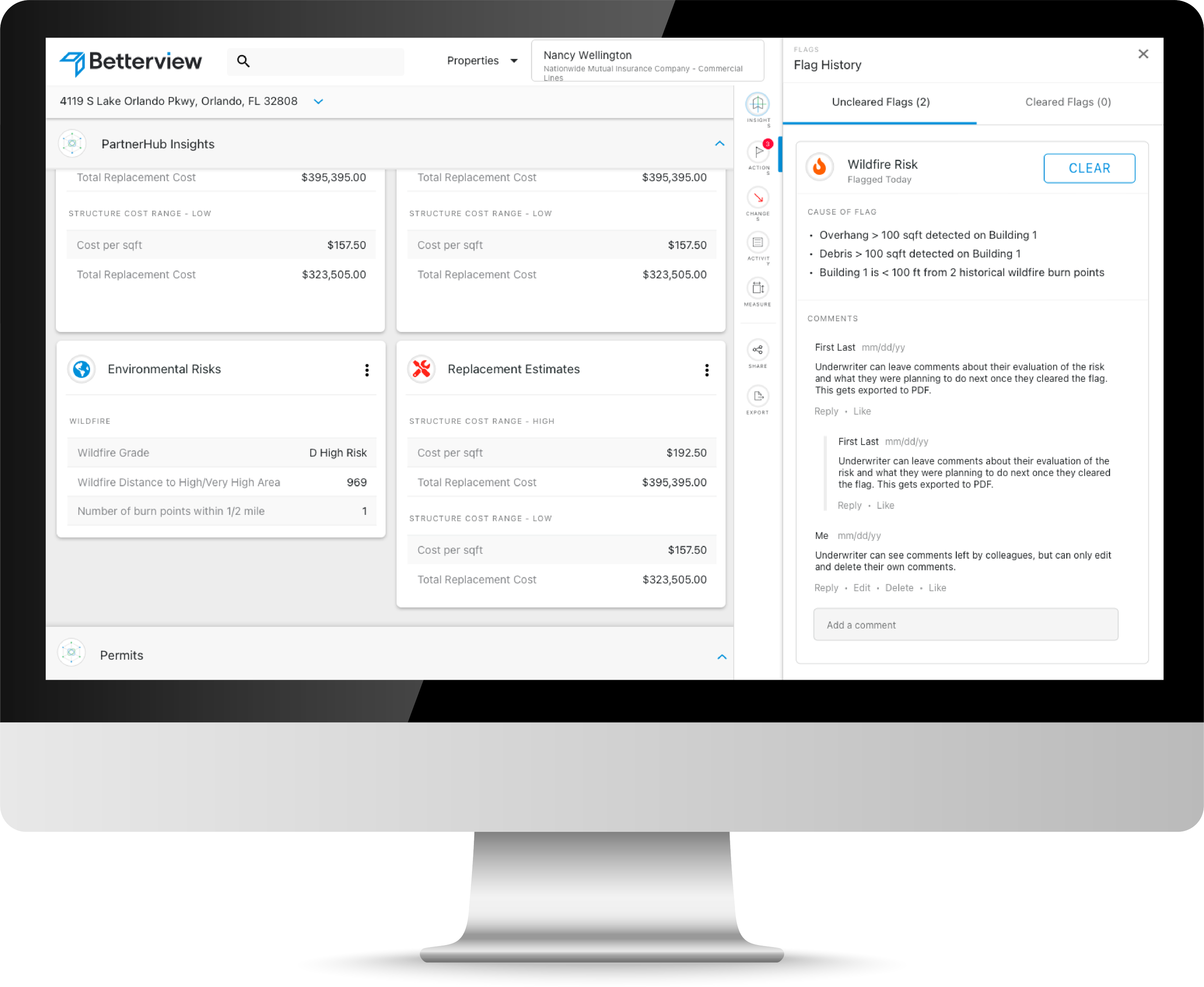
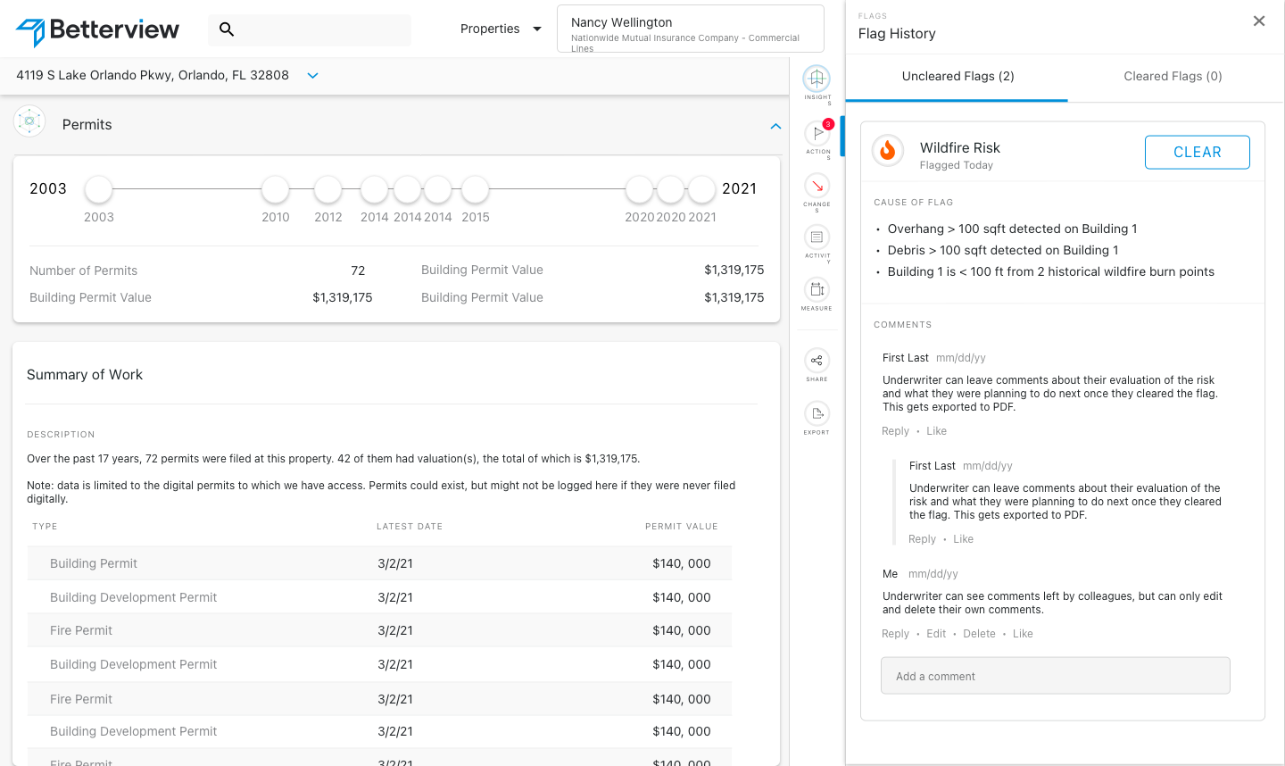
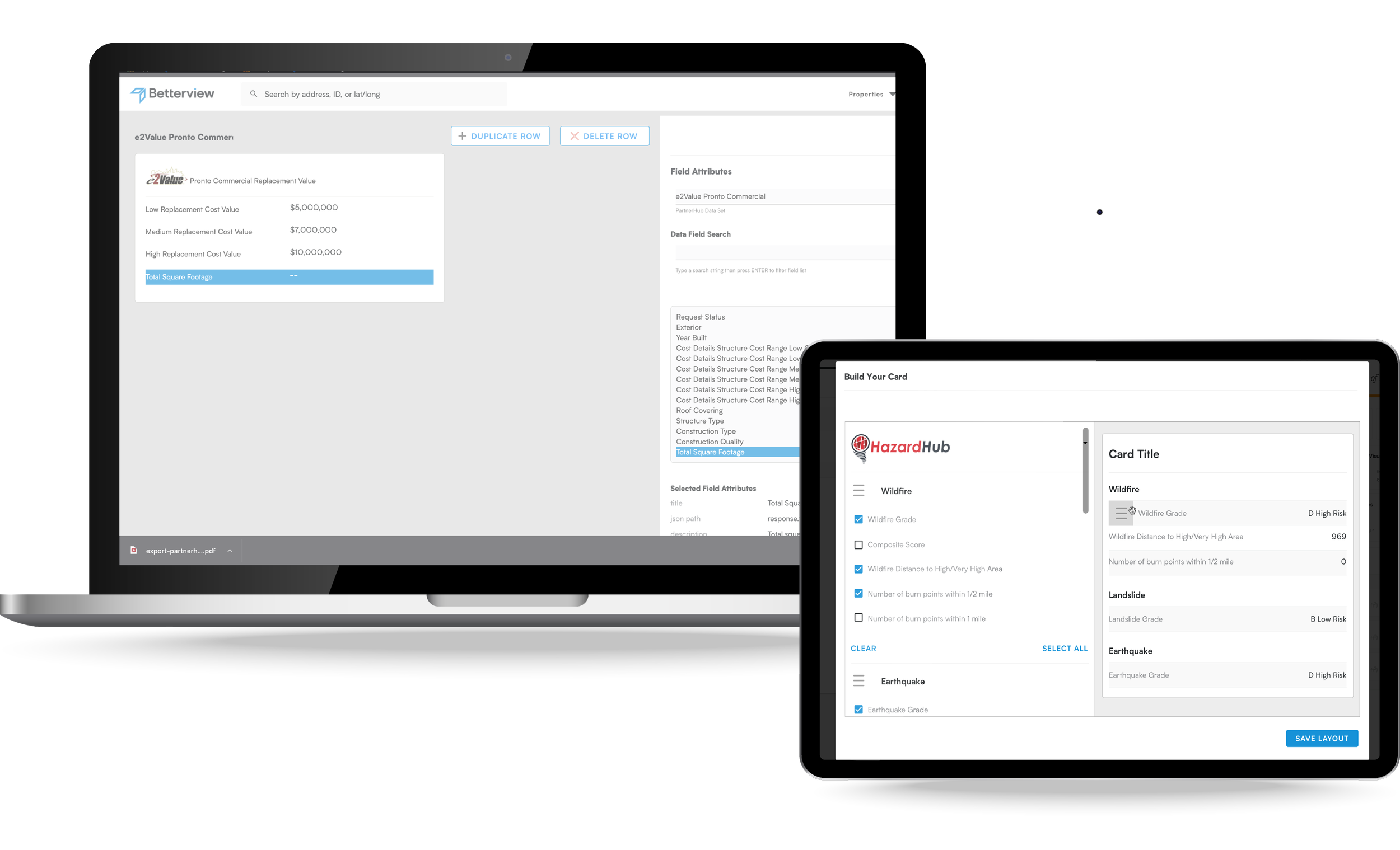
Dashboard configuration interface showing modular customization options
Research & Discovery
The project kicked off with a deep dive into the current landscape of Betterview's platform and the new data challenges presented by PartnerHub.
User Pain Points
- • Data overload from multiple sources
- • Limited customization options
- • Inefficient data visualization
- • Complex navigation
User Needs
- • Personalized dashboard layouts
- • Flexible data visualization
- • Intuitive customization
- • Streamlined workflows
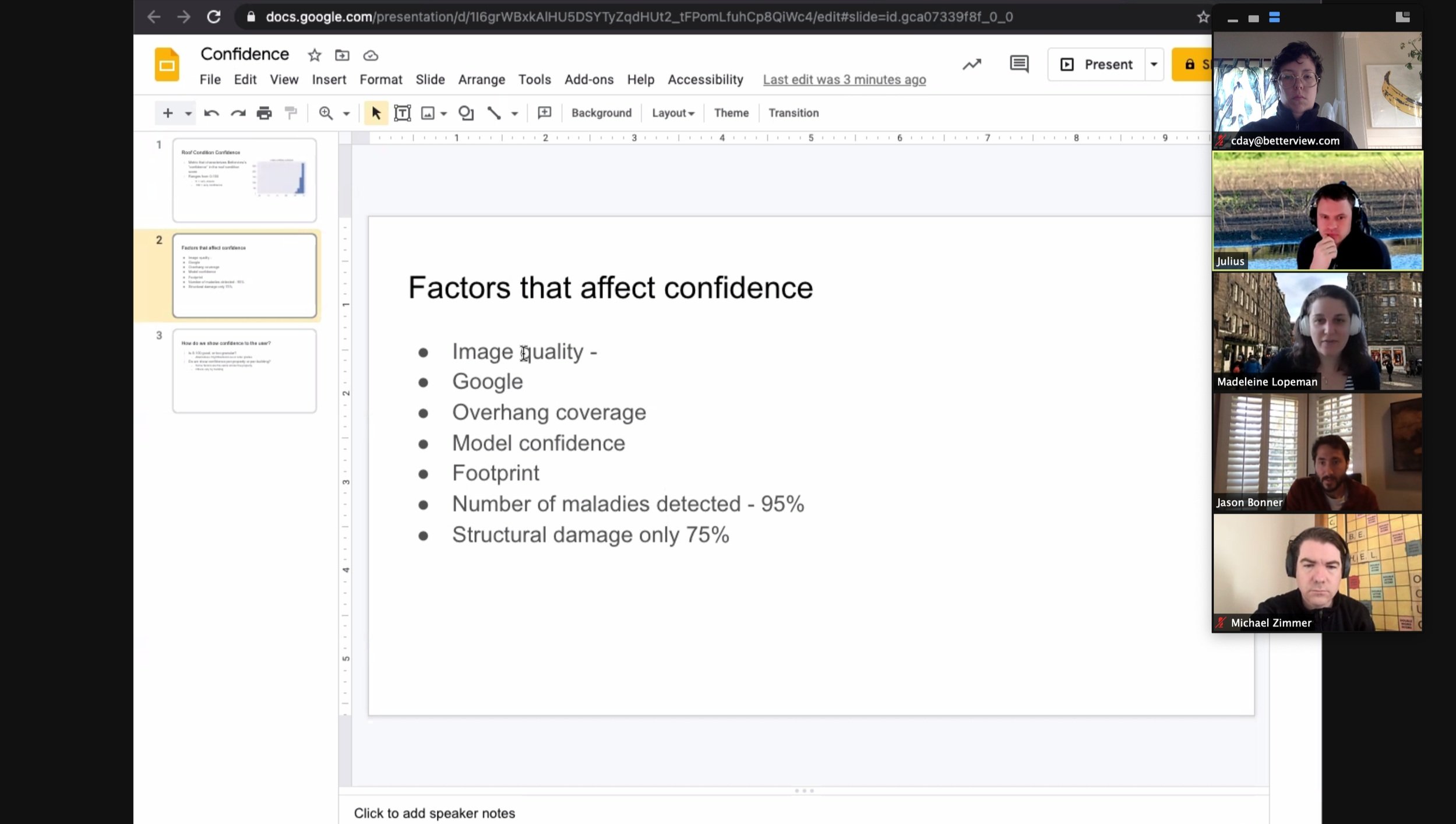
Research metrics combined with team expertise shaped our first release features
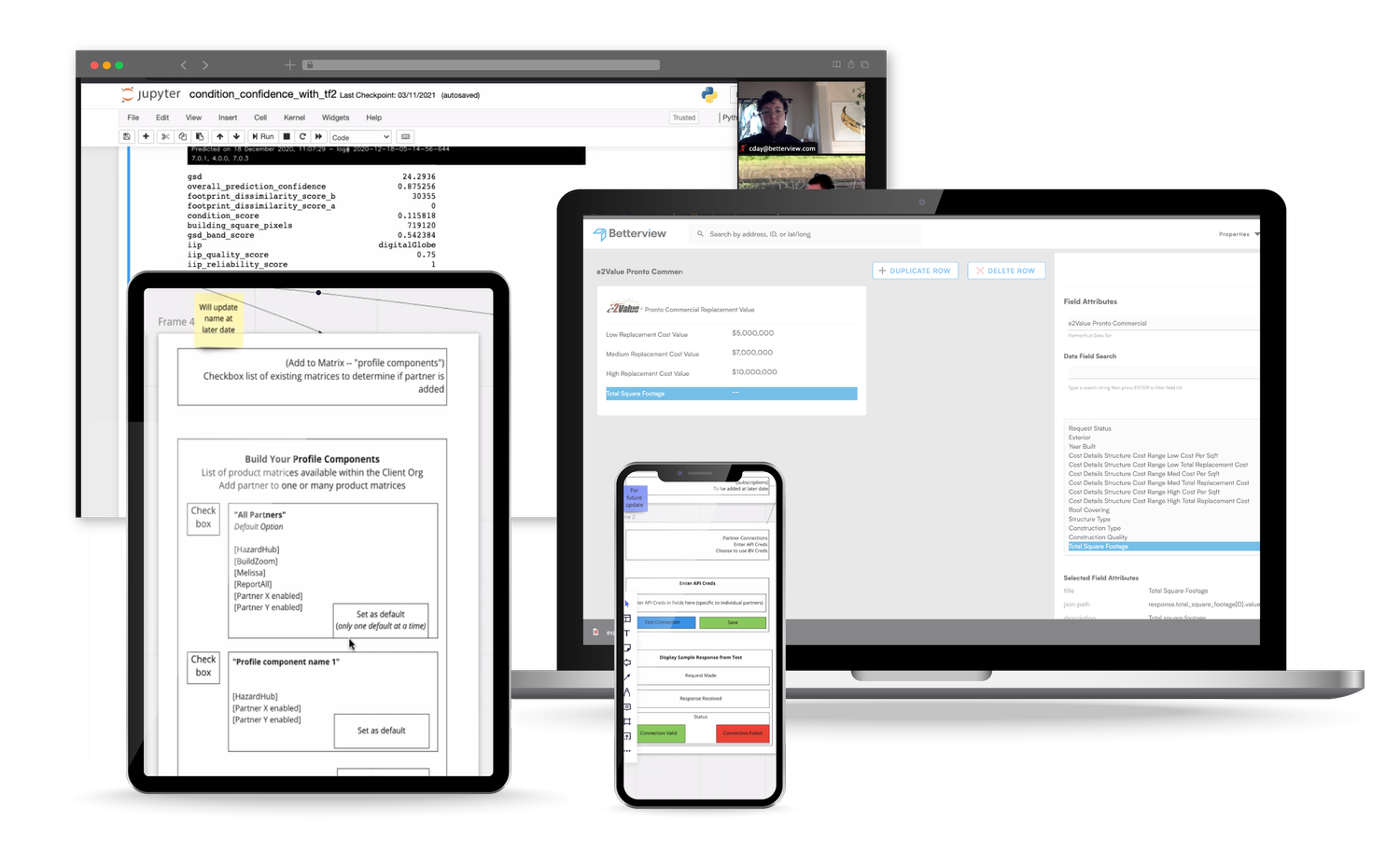
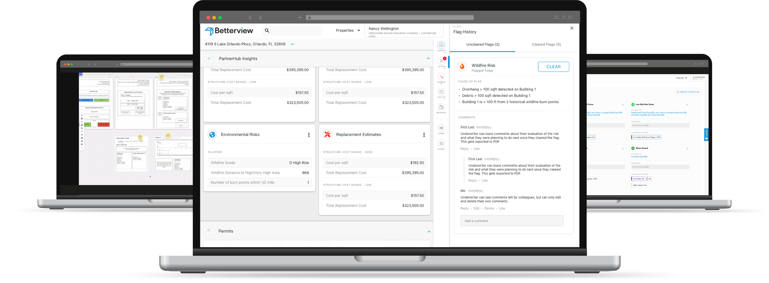
Design Development
The design process focused on creating a modular system that would make complex property data accessible and actionable. Through iterative design and user testing, we developed a flexible interface that could adapt to various user needs while maintaining consistency and usability.
Key Features
- • Modular Dashboard Components
- • Drag-and-Drop Interface
- • Custom Data Visualization
- • Real-time Updates
Design Process
- • User Flow Mapping
- • Wireframing
- • Interactive Prototyping
- • Usability Testing
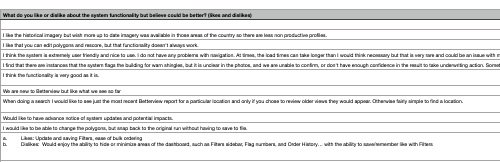
User Surveys and other research allowed design to be driven by data
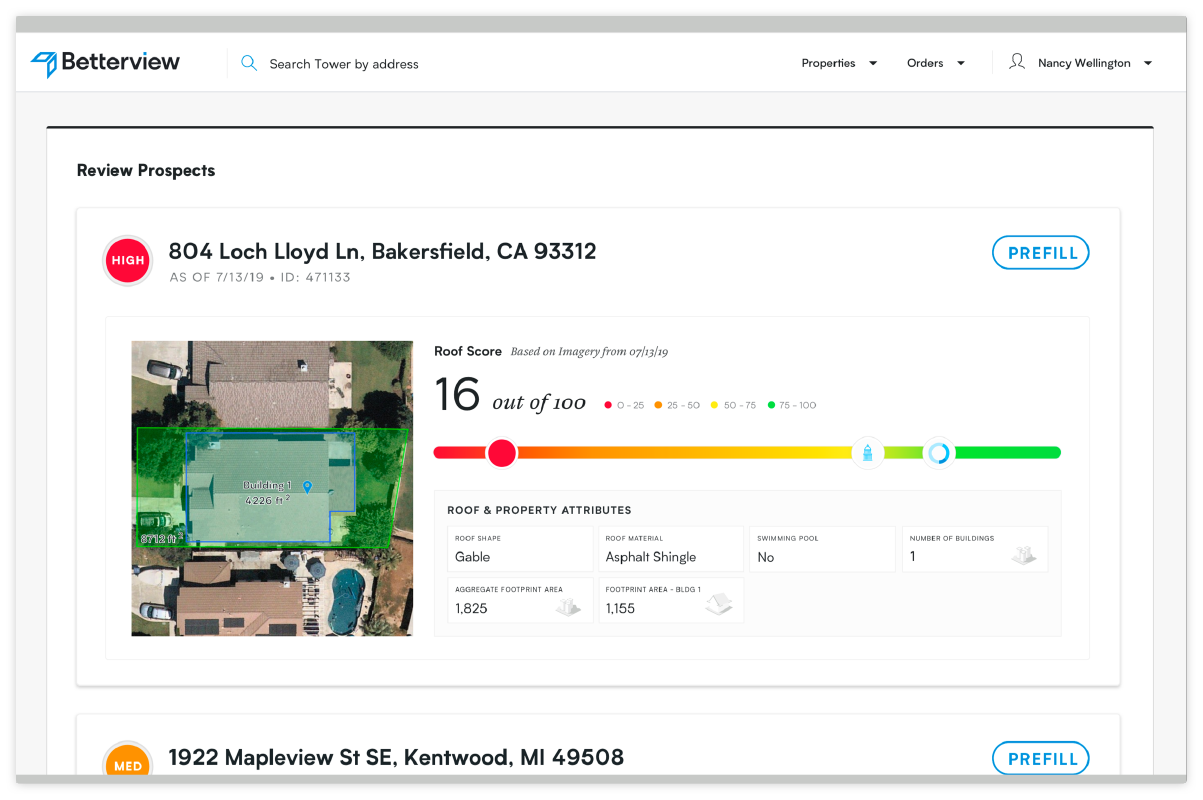
Customized Data Points are brought to life with easy-to-read summaries and visualizations
Implementation
The implementation phase focused on creating a robust, scalable system that could handle real-time data processing and provide accurate risk assessments. Key technical challenges included:
Technical Challenges
- • Real-time data processing
- • State management
- • Performance optimization
- • Cross-browser compatibility
Solutions
- • Modular architecture
- • Efficient data caching
- • Progressive loading
- • Responsive design
Results
The introduction of the Customizable UI to the Betterview platform marked a significant advancement in how insurance underwriters interact with property data. The successful implementation of this feature led to several key outcomes:
Business Impact
- • 40% increase in user engagement
- • 35% improvement in task completion
- • 50% reduction in support tickets
- • 45% growth in user satisfaction
User Feedback
- • Improved workflow efficiency
- • Better data visualization
- • Enhanced customization
- • Increased productivity