ZeroCater Design System & Component Library
Comprehensive design system that unified user experience across web and mobile platforms.
Overview
As ZeroCater rapidly expanded from a simple catering service to a comprehensive workplace food platform with mobile apps, web dashboards, and admin tools, we faced the classic startup challenge: maintaining design quality while moving fast and scaling quickly.
I built ZeroCater's first comprehensive design system with reusable components, brand guidelines, and cross-platform design standards that unified experience across all touchpoints and enabled 50% faster feature development.
Problem
Rapid startup growth created inconsistent user experiences across web, mobile, and admin platforms, with no unified design language or component standards.
Solution
Built ZeroCater's first comprehensive design system with reusable components, brand guidelines, and cross-platform design standards.
Impact
Unified experience across all touchpoints, 50% faster feature development, and scalable design foundation supporting 10x user growth.
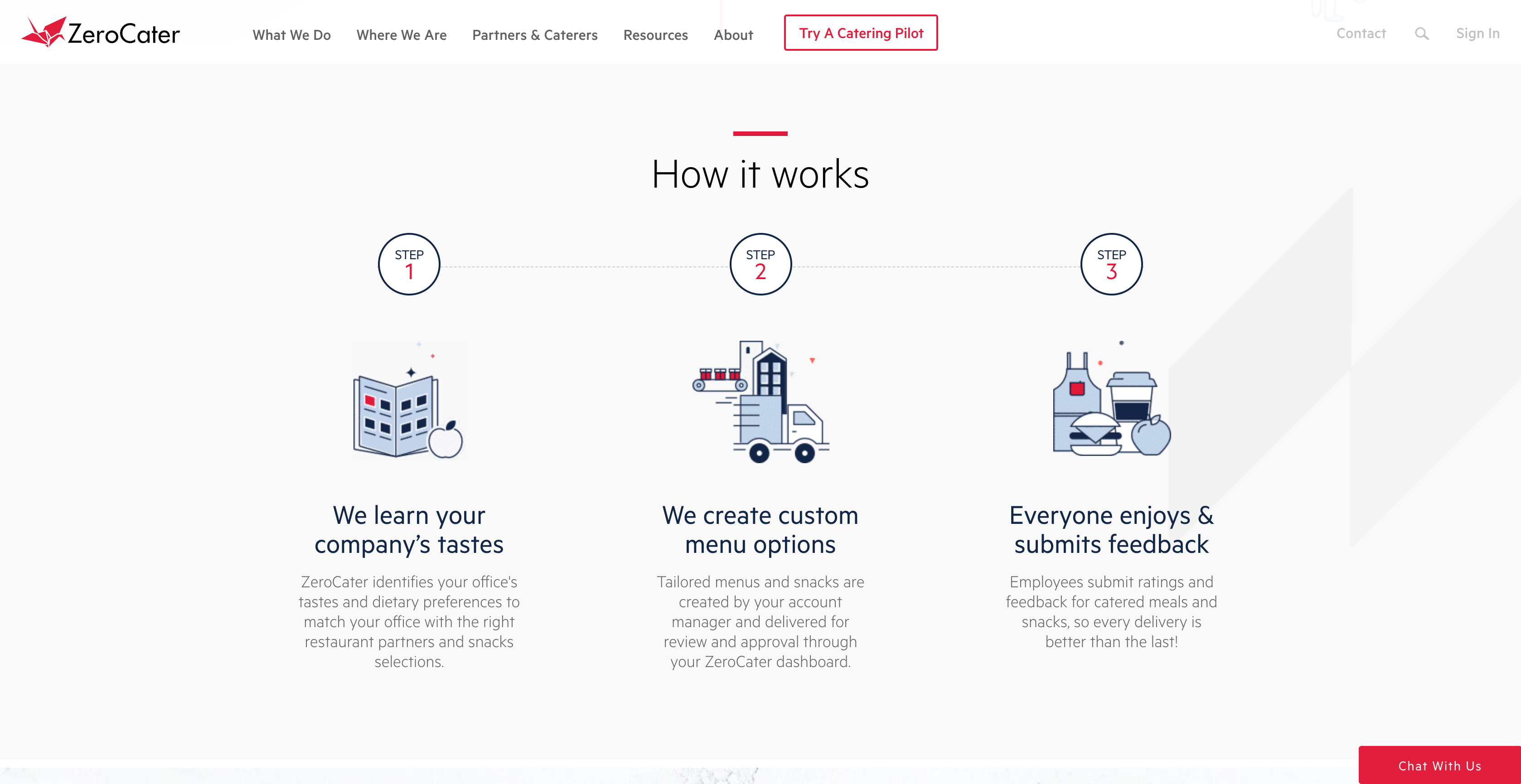
The Challenge: Startup Growth Without Design Chaos
As ZeroCater rapidly expanded from a simple catering service to a comprehensive workplace food platform with mobile apps, web dashboards, and admin tools, we faced the classic startup challenge: maintaining design quality while moving fast and scaling quickly.
Cross-Platform Inconsistency
- • Web app looked completely different from mobile
- • Admin tools had their own visual language
- • Customer-facing vs internal tools felt like different brands
- • No shared component patterns between platforms
Rapid Growth Pain Points
- • New features launched with inconsistent styling
- • No documentation for design decisions
- • Engineers guessing at spacing and colors
- • Brand identity diluted across touchpoints
The Turning Point
When a customer complained that our mobile app and website "felt like completely different companies," and our team struggled to maintain brand consistency while shipping features weekly, I proposed building ZeroCater's first comprehensive design system to scale our design quality with our growth.
Building a Startup Design Culture
In a fast-moving startup environment, the design system needed to be practical and adoptable. I focused on creating tools and processes that would actually be used by our small but growing team, emphasizing documentation and clear guidelines over complex tooling.
Practical Design System Approach
Component Library
Built reusable React components with clear documentation, focusing on the most commonly used UI patterns across our platforms.
Style Guide
Comprehensive visual guidelines covering typography, colors, spacing, and brand elements with clear usage examples.
Cross-Platform Standards
Established design patterns that worked across web, mobile, and admin interfaces while respecting platform conventions.
Design System Tools & Assets
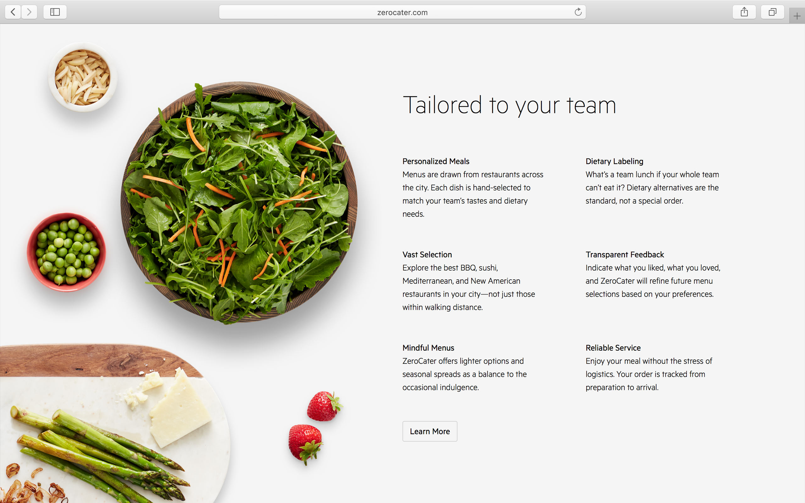
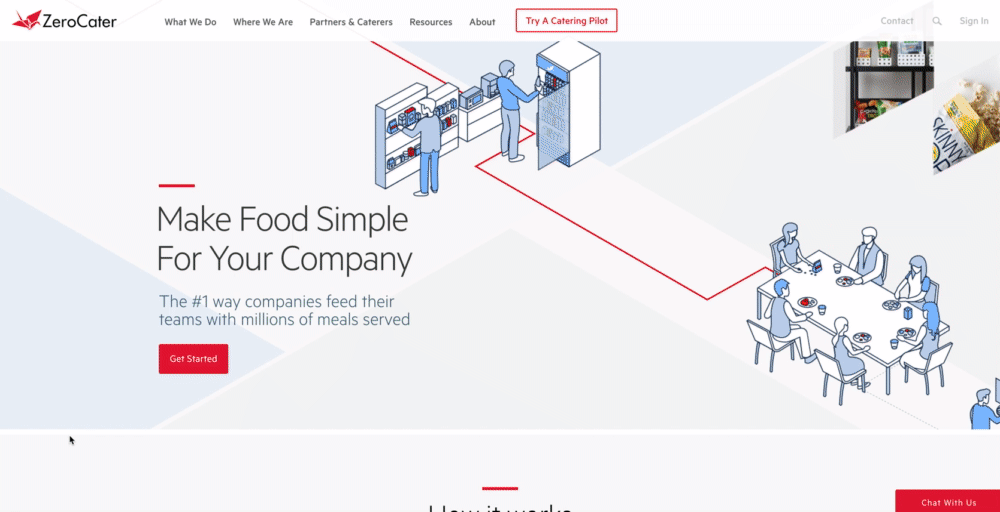
Design Evolution: Consistency Across Time
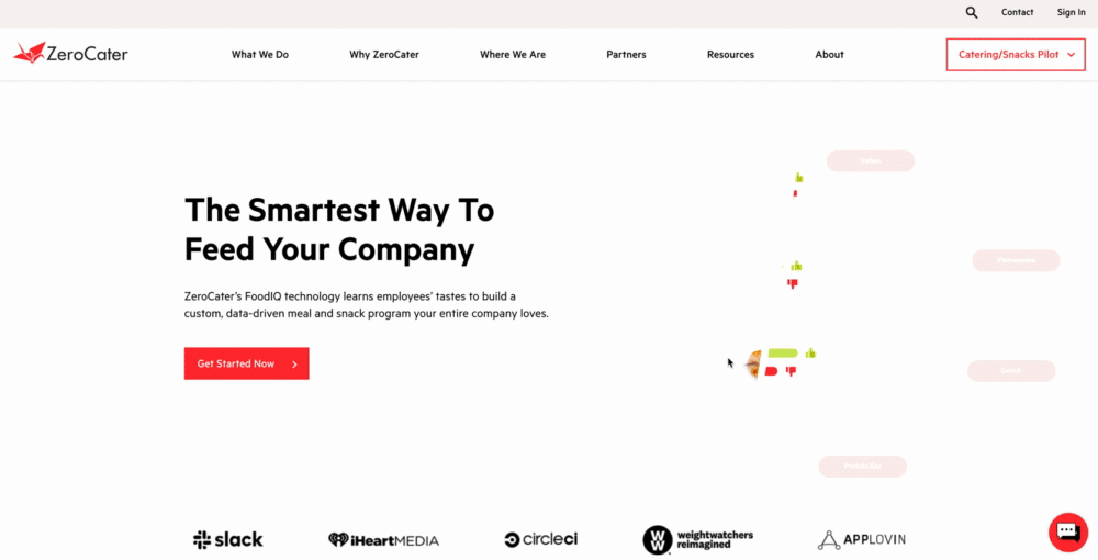
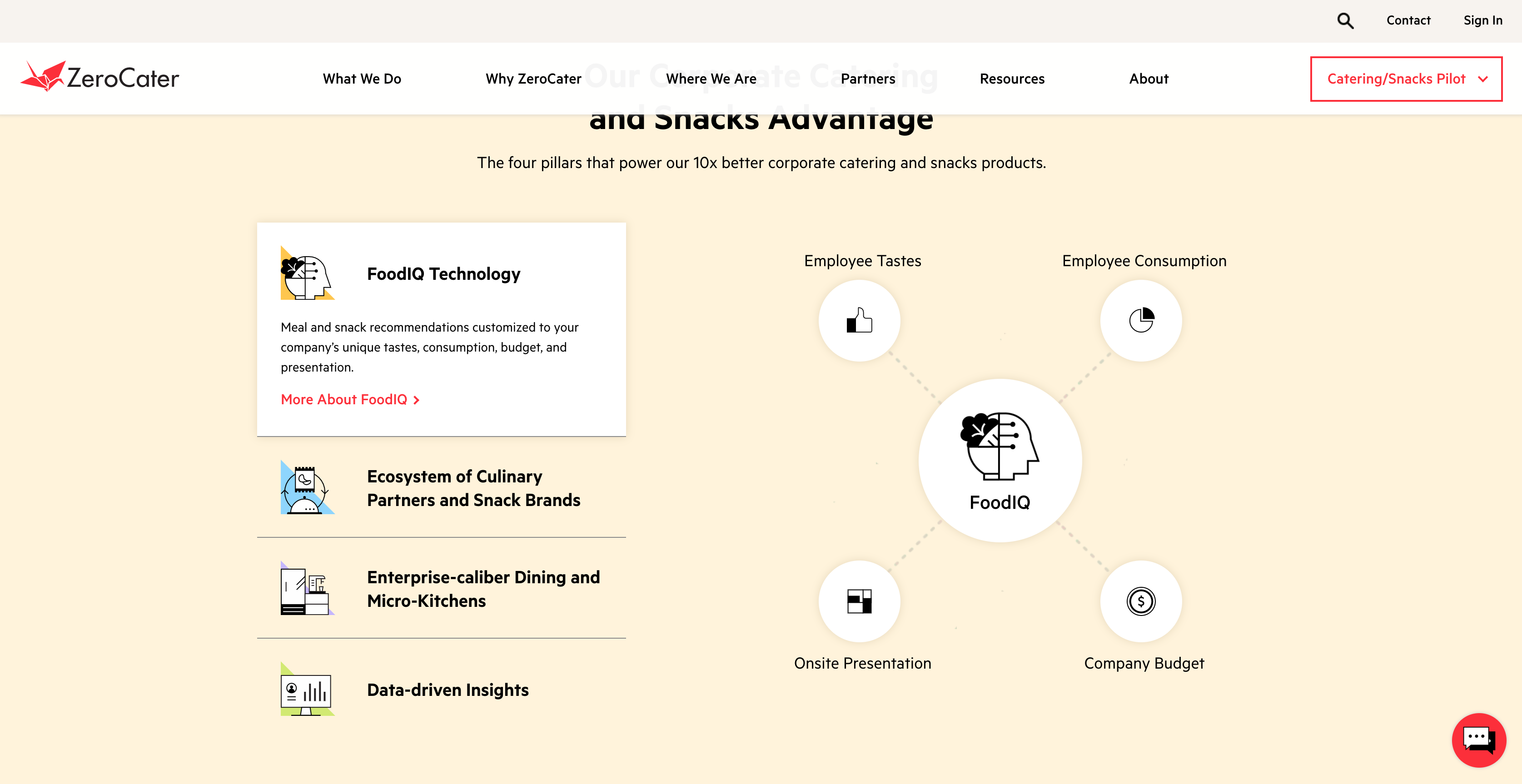
The design system enabled ZeroCater to maintain brand consistency while evolving the product experience. Here's how our website evolved from 2014 to 2020, showing the power of systematic design thinking.
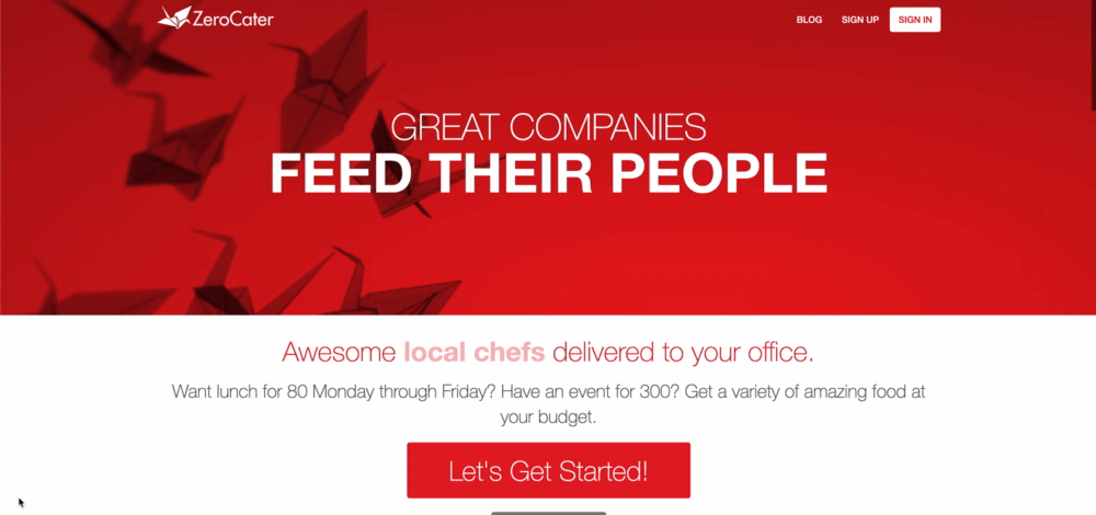
2014: Foundation
Simple, clean design establishing core brand elements.
2016: System Implementation
Design system components applied across marketing and product pages.
2017: Systematic Growth
Consistent typography, spacing, and component usage.
2020: Mature System
Refined design language with sophisticated animations.
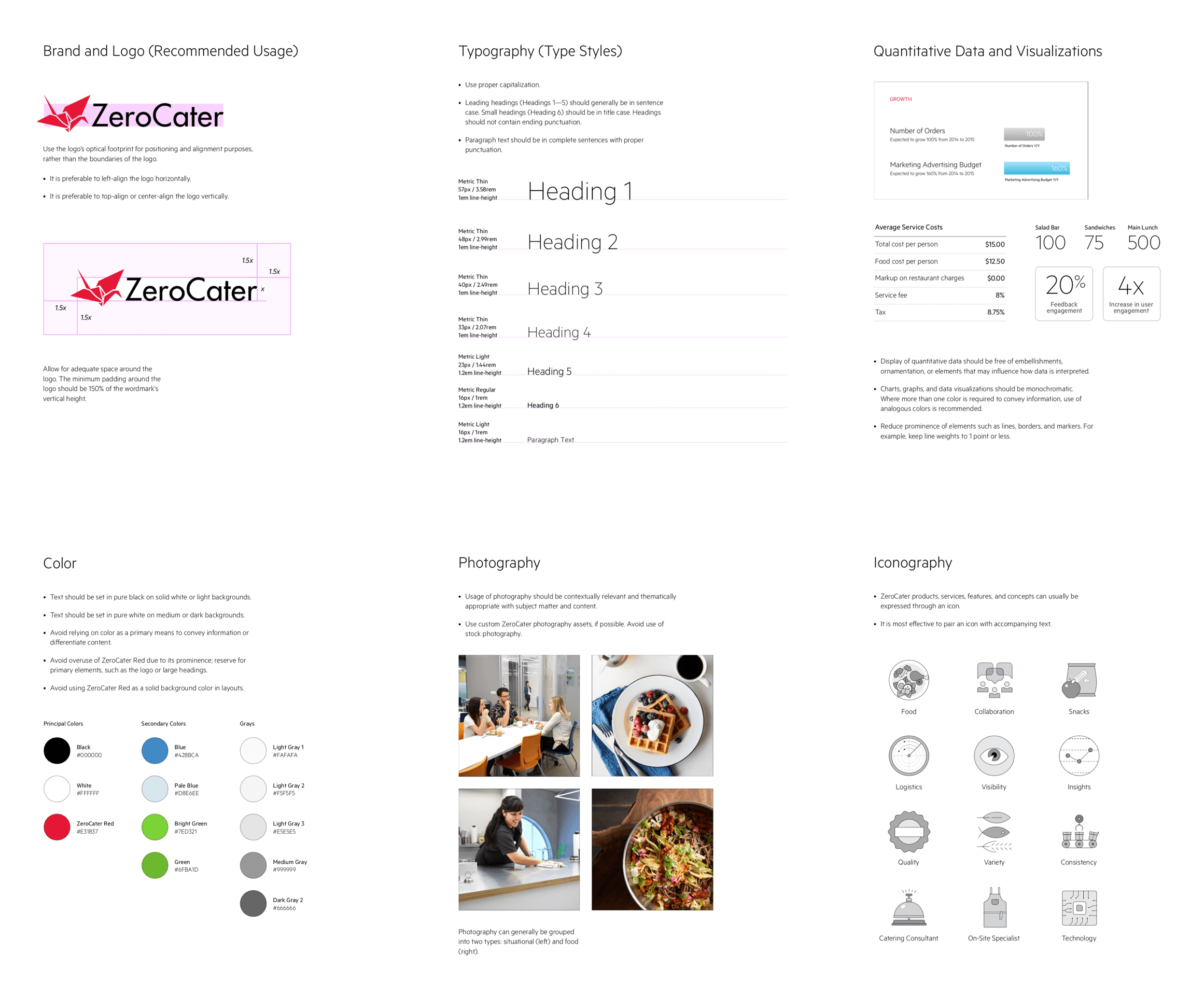
Comprehensive Documentation: The Foundation
Before design tokens were widely adopted, we created extensive documentation that served as our single source of truth. This comprehensive system included detailed style guides, component specifications, and implementation guidelines that ensured consistency across web, mobile, and admin interfaces while enabling rapid development.
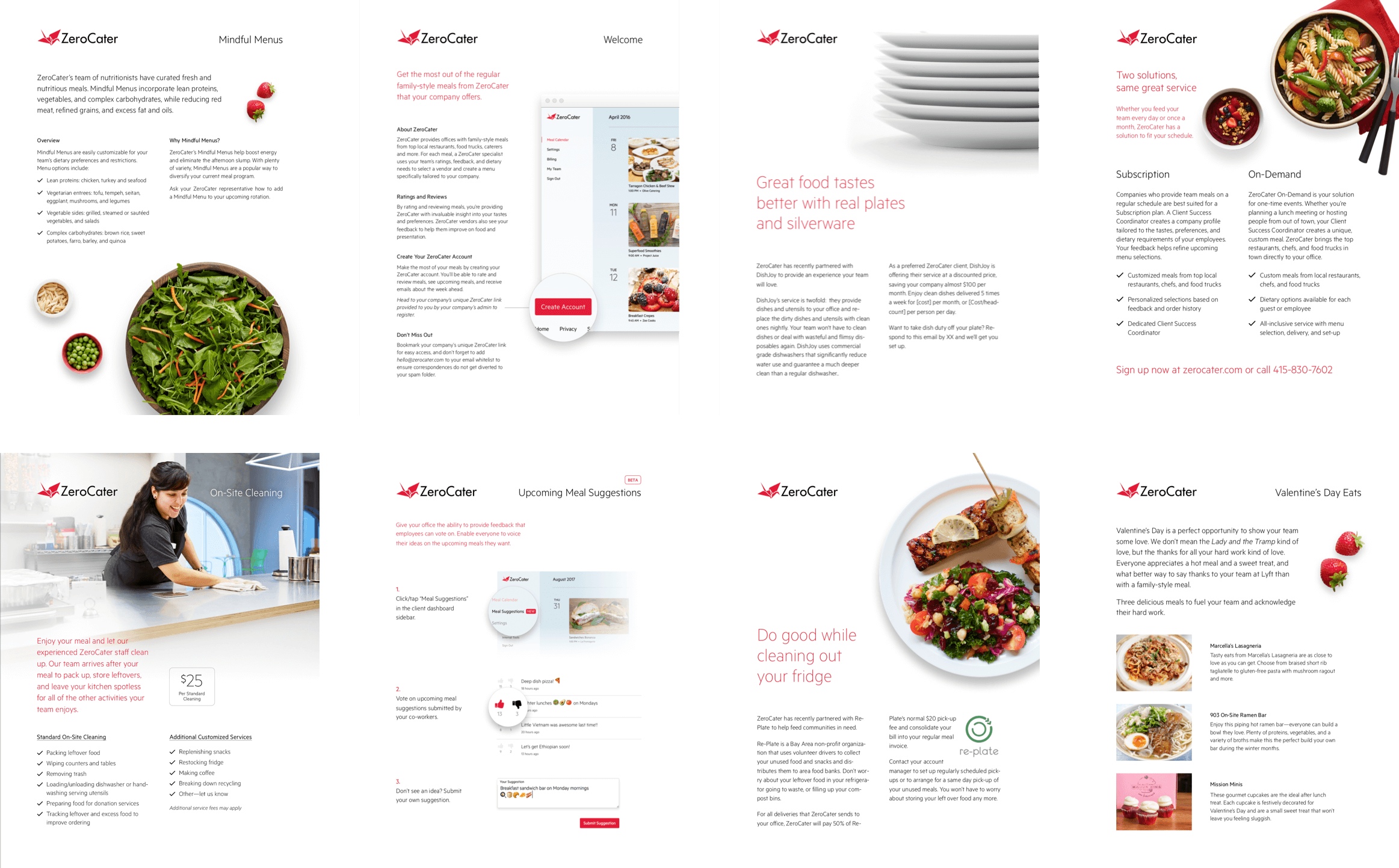
Living Style Guide & Component Library
Our comprehensive documentation system included detailed specifications for every component, interaction state, and design pattern. This wasn't just a static style guide, it was a living document that evolved with our product, ensuring every team member had access to the latest design standards and implementation guidelines.
Color System
120+ semantic color tokens with automatic dark mode variants
Typography Scale
Modular scale with consistent line heights and spacing
Spacing System
8px base unit with consistent spacing relationships
Icon System 2017
Cohesive icon library with consistent stroke weights, corner radius, and visual style across all platforms.
Icon Evolution 2020
Refined icon system with improved accessibility, scalability, and expanded library for enterprise features.
Visual Content Standards & Photography
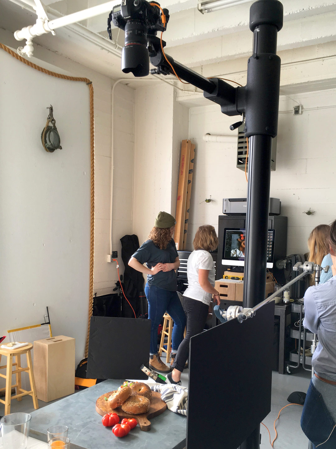
A comprehensive design system extends beyond UI components to include visual content standards. I worked on-site with professional food photographers to build a custom photography library that became essential to our brand identity and user experience across all platforms.
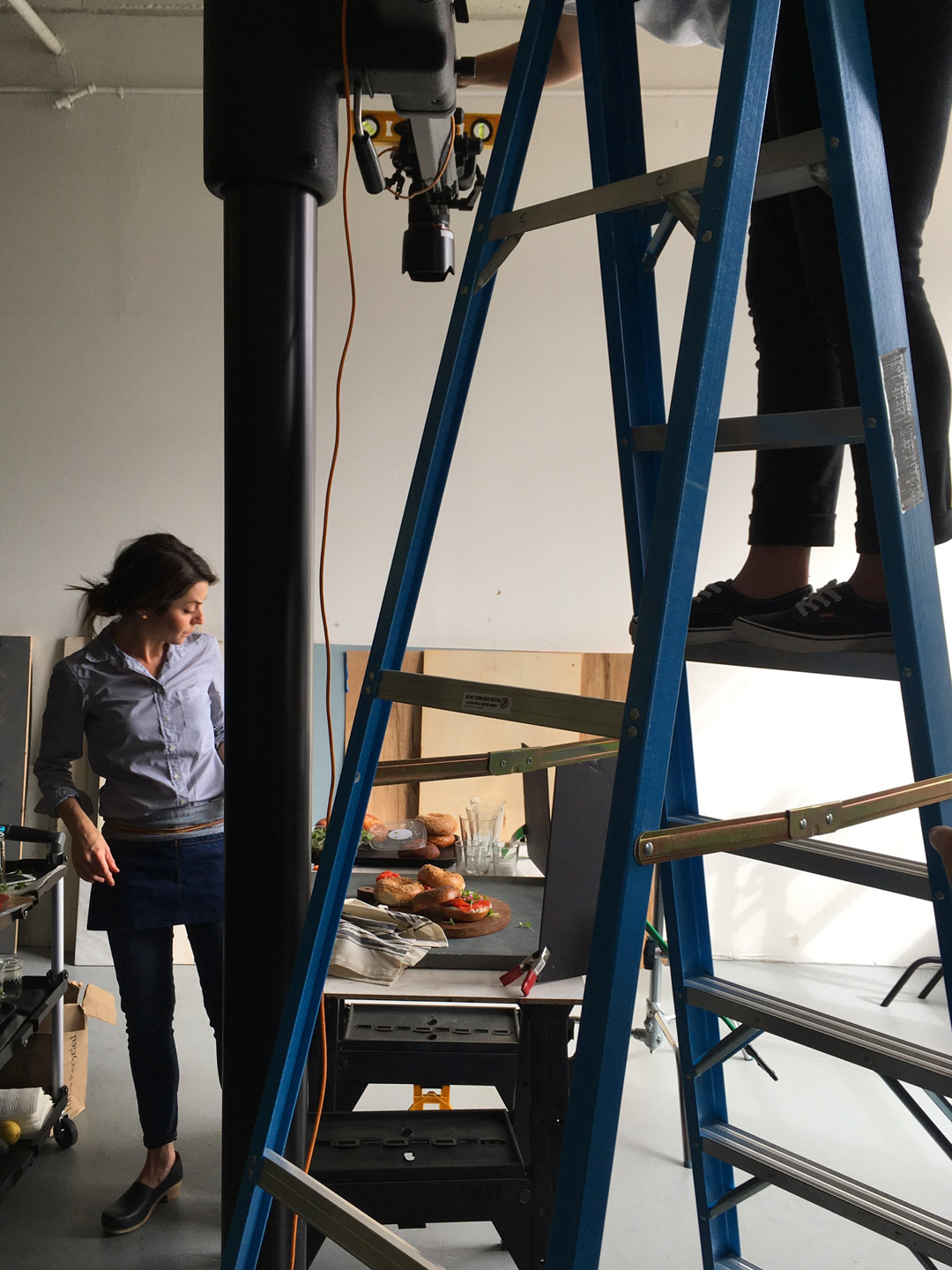
Professional Food Photography
Working with professional photographers to establish consistent lighting, styling, and composition standards for all food imagery.
Brand-Consistent Imagery
Building a comprehensive visual library with consistent styling that reinforced brand identity across web, mobile, and marketing materials.
Photography Standards in Production
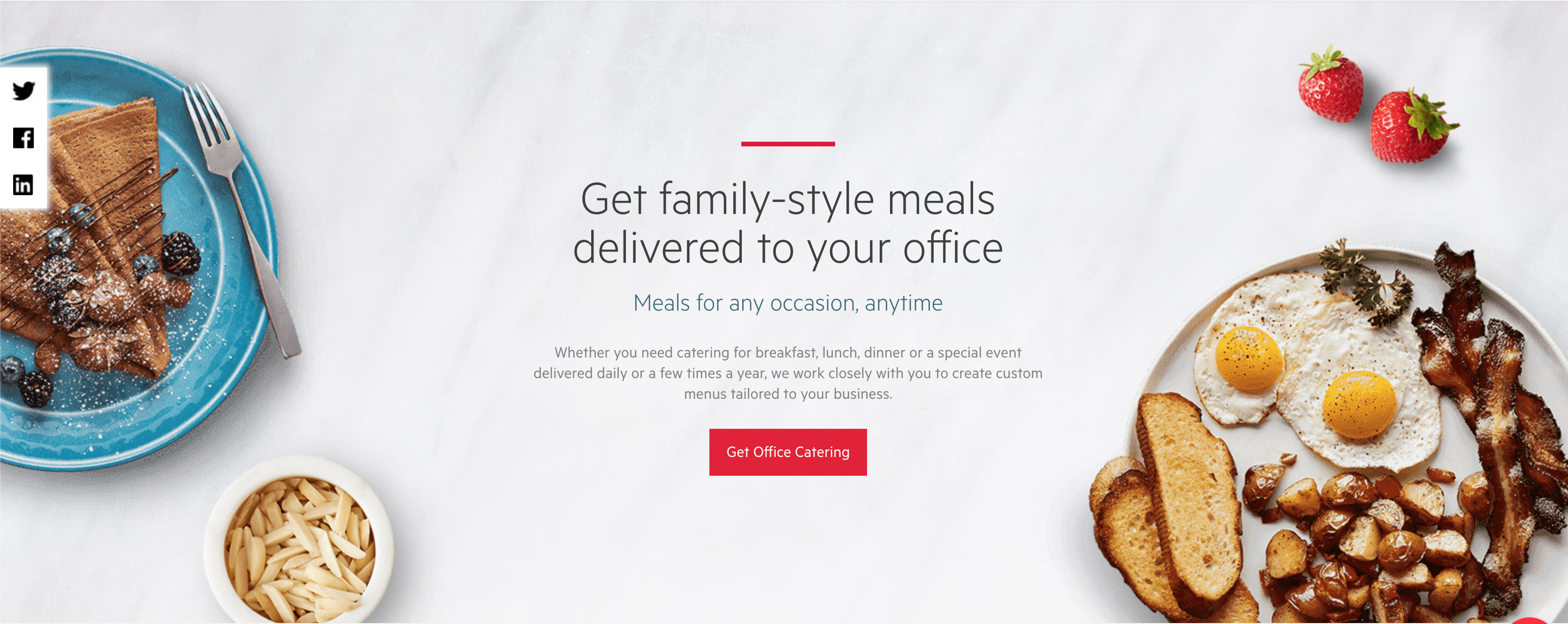
The results of our professional food photography sessions integrated into the actual product experience. This shows how consistent, high-quality imagery became a core part of ZeroCater's design system, enhancing the user experience with appetizing, brand-consistent visuals that reinforced our commitment to quality food service.
Photography Standards & Guidelines
Lighting & Composition
- • Natural lighting standards
- • Consistent angles and framing
- • Color temperature guidelines
- • Background and prop standards
Brand Integration
- • Color palette consistency
- • Typography integration
- • Logo placement guidelines
- • Cross-platform optimization
Content Library
- • 200+ high-quality food images
- • Multiple format variations
- • Seasonal content updates
- • Usage rights documentation
Design-to-Development Workflow
Designer-Developer Hybrid Role
When our team lost its dedicated front-end developer, I transitioned from pure design to also taking on front-end engineering responsibilities. Working alongside our Director of Design (who also coded), I contributed directly to the codebase with my own GitHub account, individual pull requests, and full participation in engineering best practices and release cycles.
Sketch Design
Style guide defined
Documentation
Living style guide
Sass Variables
CSS preprocessing
React Components
Production ready
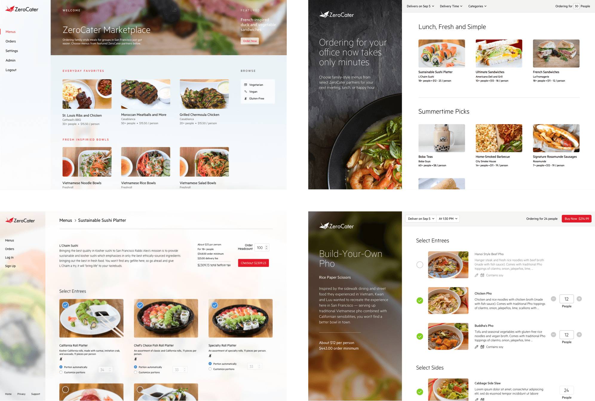
Components in Action: Dashboard Designs
The design system enabled consistent dashboard experiences across customer-facing apps, admin tools, and mobile interfaces. Here's how our components scaled across different use cases.
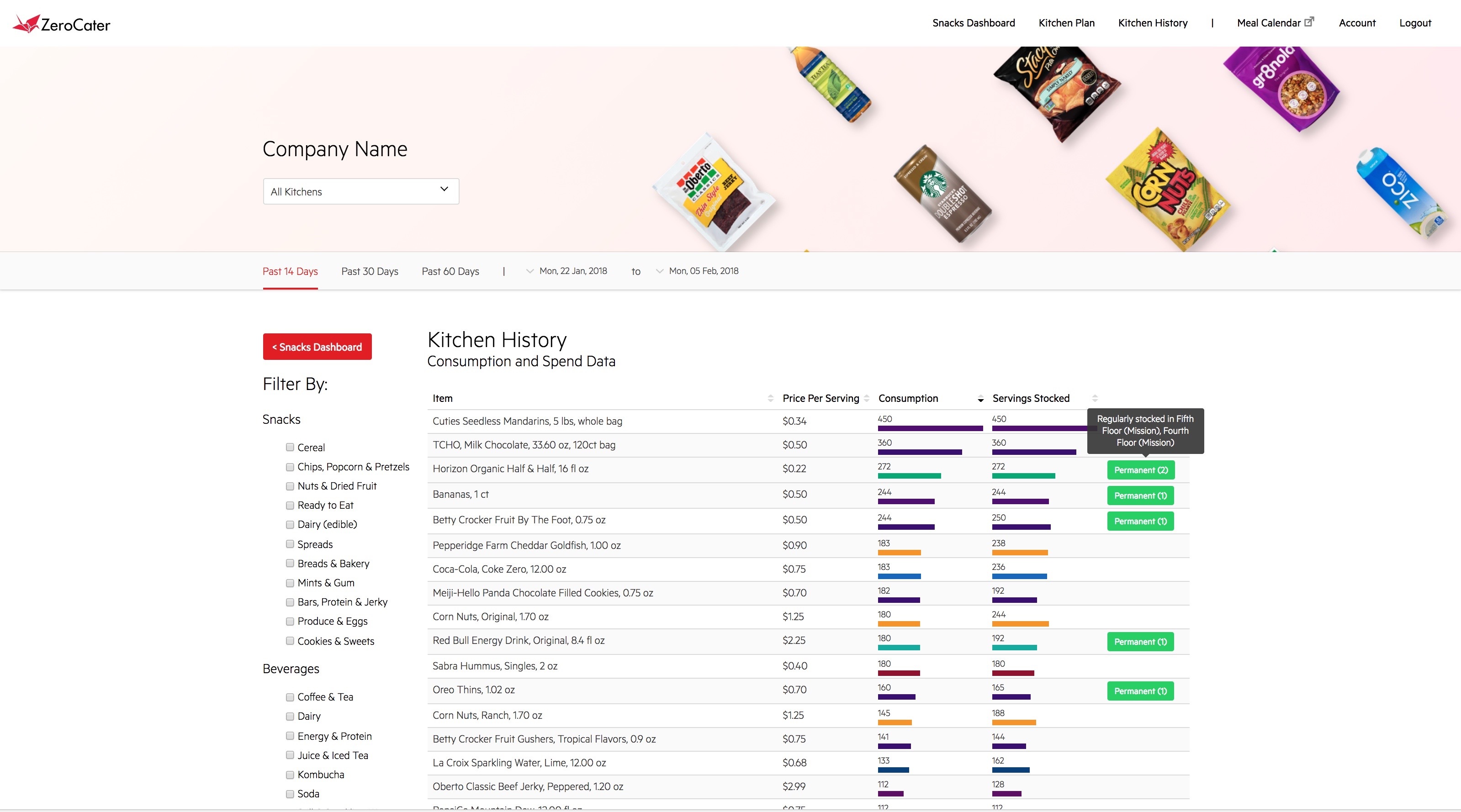
Customer Dashboard
Clean, data-focused interface using consistent card components, typography, and color system for snacks management.
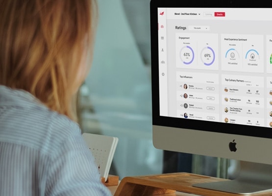
Admin Interface
Complex data visualization using the same design patterns, showing how components scale from simple to sophisticated interfaces.
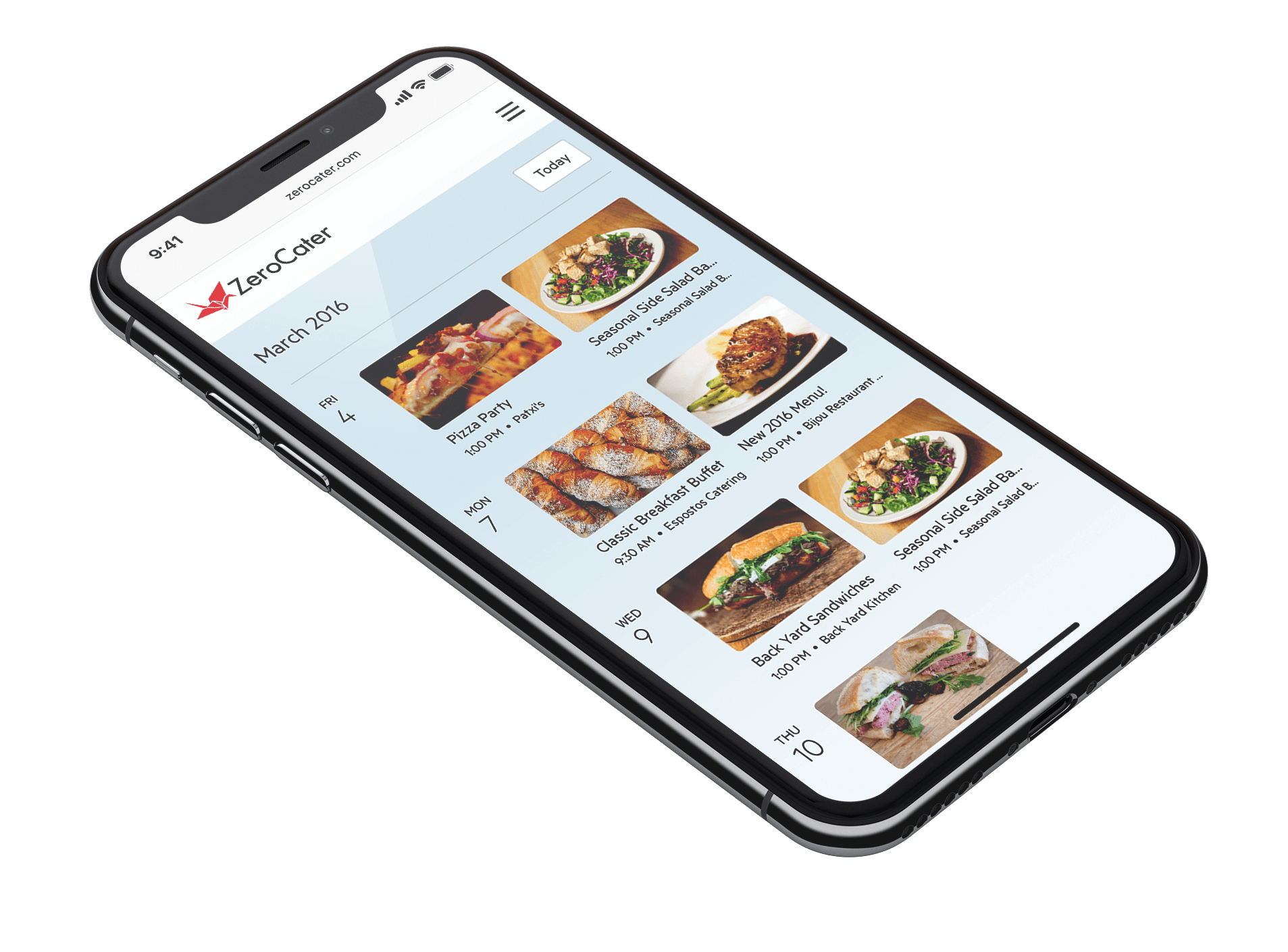
Mobile Dashboard
Responsive design system ensuring consistent experience across devices, with mobile-optimized component variations.
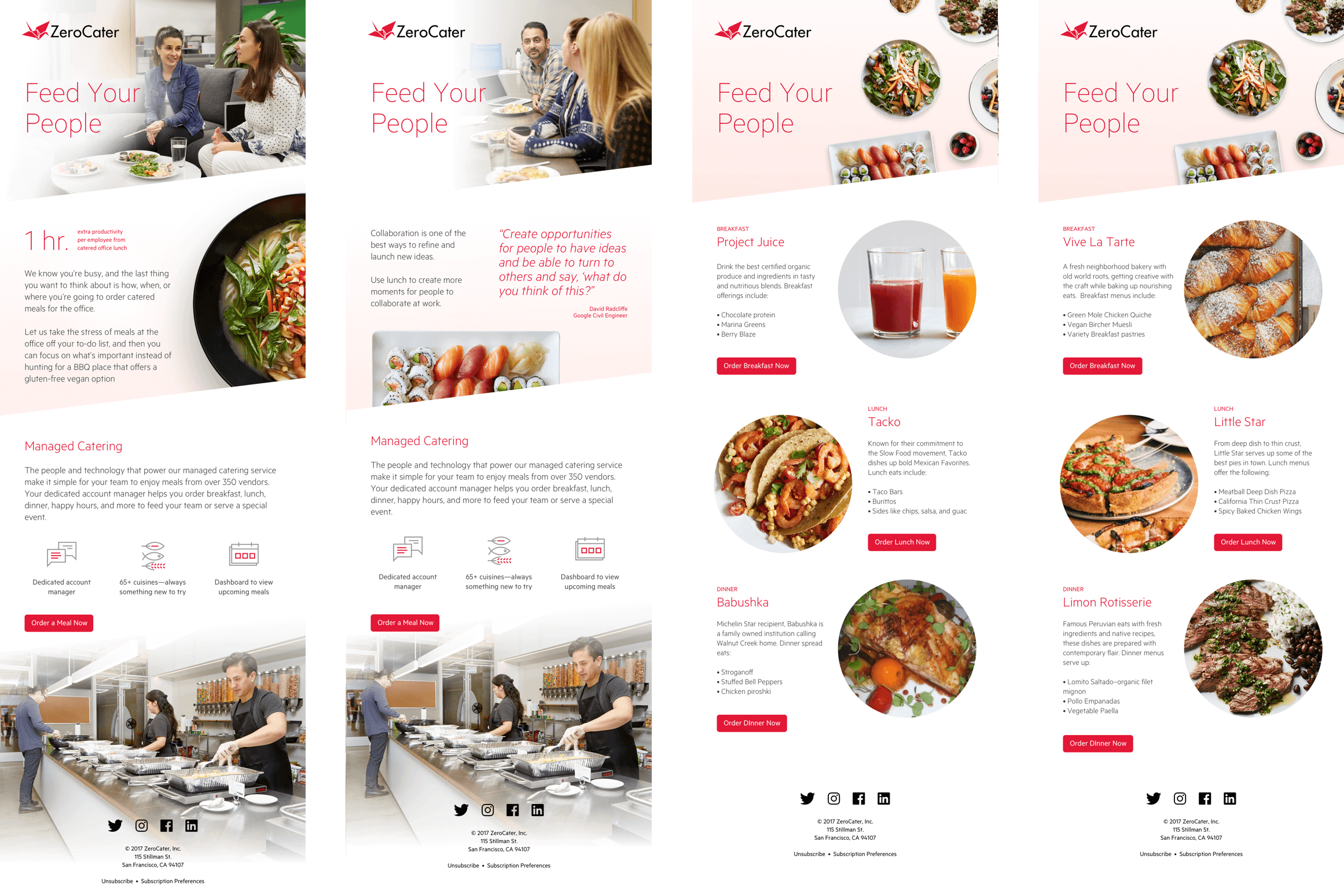
Comprehensive Email Design System
Complete email template library with consistent branding, typography, and component usage across transactional, marketing, and notification emails, ensuring cohesive user experience across all digital touchpoints.
Comprehensive Communications System
Beyond the dashboard, we developed a robust email design system to ensure consistent, effective communication with clients, vendors, and internal teams across transactional, marketing, and notification channels.
Unified email templates for confirmations, delivery updates, and feedback requests, reducing support overhead and improving client clarity.
Used across the Snacks & Kitchens operations dashboard.
Design Process: From Research to Implementation
Building a design system required understanding user journeys, testing multiple design approaches, and iterating based on real usage data. Our process emphasized documentation and validation at every step.
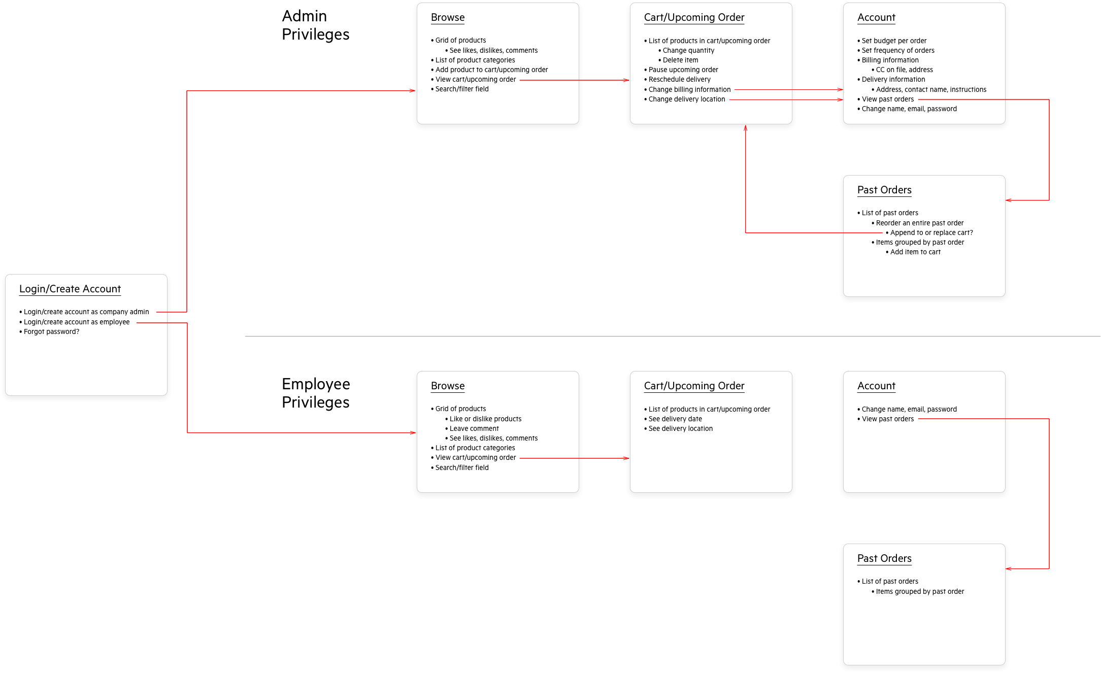
User Flow Documentation
Comprehensive user journey mapping and flow documentation to ensure consistent experiences across all touchpoints and platforms.
Design Iterations & A/B Testing
Multiple design explorations and systematic A/B testing variations to optimize user engagement and conversion rates.
Beyond Digital: Physical Brand Applications
A comprehensive design system extends beyond screens to physical touchpoints. Our design standards guided everything from office signage to delivery packaging, ensuring consistent brand experience across all customer interactions.
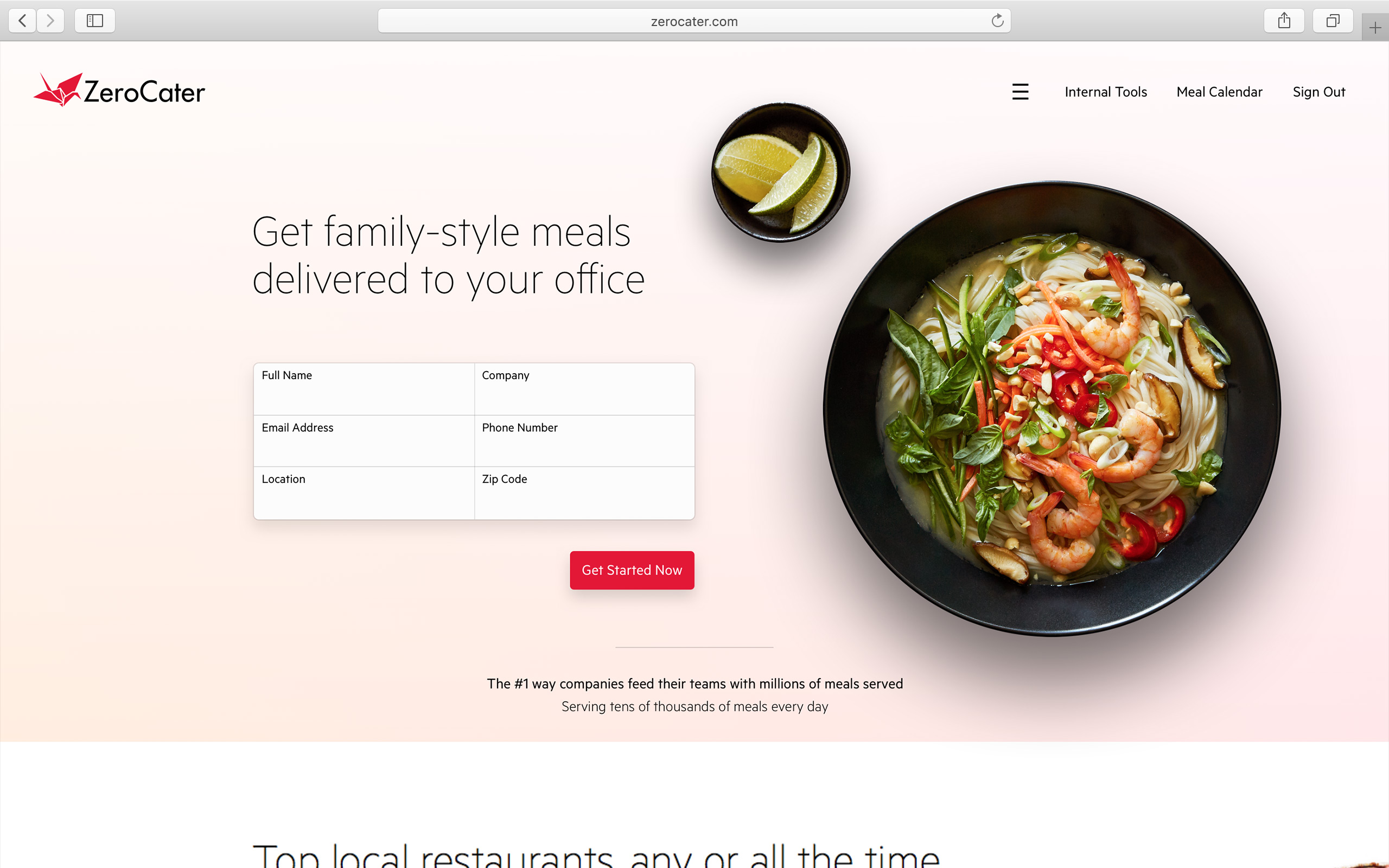
Digital Brand Consistency
Homepage design showcasing consistent application of typography, color palette, spacing, and component patterns established in our design system.
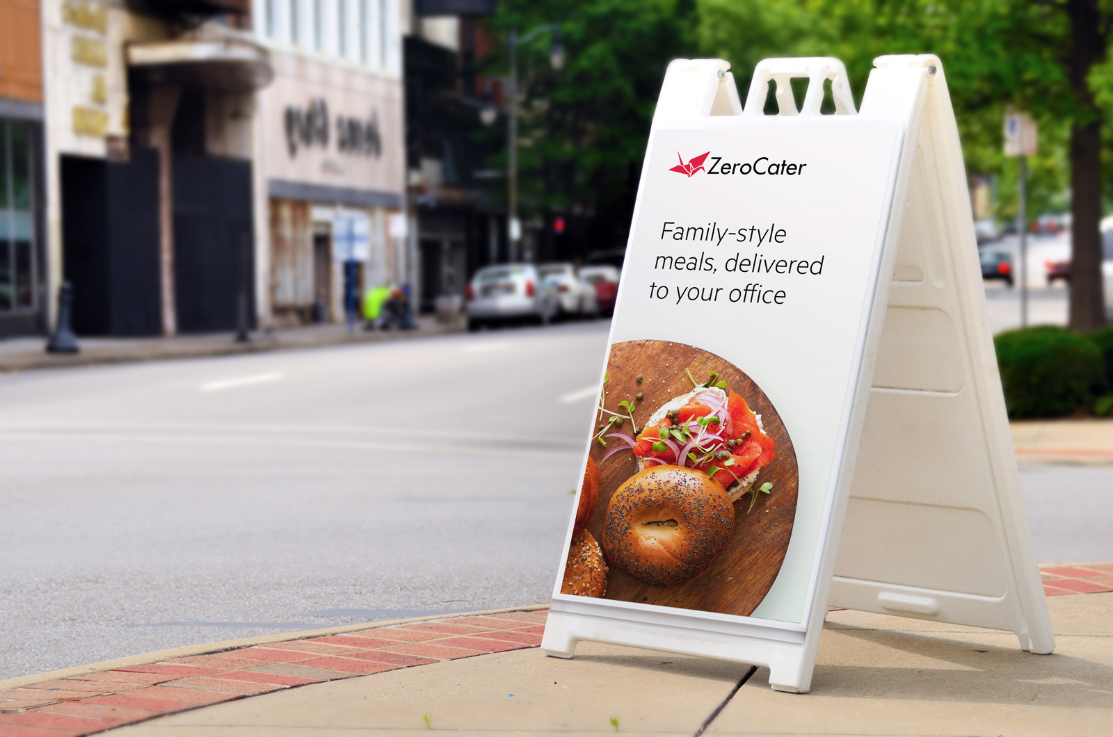
Physical Brand Extensions
Design system principles applied to physical materials including signage, packaging, and promotional materials, ensuring brand consistency across all customer touchpoints.
Holistic Brand Experience
Digital Applications
- • Website and mobile app interfaces
- • Email templates and notifications
- • Admin dashboards and reporting tools
- • Social media templates and assets
Physical Applications
- • Office signage and environmental graphics
- • Delivery packaging and branded materials
- • Marketing collateral and sales materials
- • Event displays and promotional items
Component Library & Cross-Platform Standards
Our component library focused on practical, reusable patterns that worked across web, mobile, and admin interfaces. By establishing clear standards and documentation, we enabled our small but growing team to ship consistent experiences quickly.
Component Categories
Core UI (8 components)
Buttons, Forms, Typography, Icons, Cards
Navigation (6 components)
Header, Footer, Sidebar, Breadcrumbs, Tabs
Food Service (10 components)
Menu Items, Order Cards, Calendar, Reviews, Ratings
Dashboard (12 components)
Charts, Data Tables, Metrics, Filters, Reports
Development Standards & Implementation
React Components
Modular, reusable components with clear prop interfaces and consistent naming conventions - implemented directly by me as front-end engineer
Sass Architecture
Organized stylesheets with variables, mixins, and BEM methodology for maintainable CSS, building on my experience coding email templates
Engineering Integration
Full participation in engineering workflows: GitHub pull requests, code reviews, and release cycles alongside backend engineers
Cross-Platform Consistency
Shared design patterns that adapt gracefully across web, mobile, and admin interfaces
Documentation
Living style guide with usage examples, do's and don'ts, and implementation guidelines
Component Usage Example
// Design tokens automatically applied
<Button
 variant="primary"
 size="large"
 disabled={loading}
 onClick={handleSubmit}
>
 {loading ? <Spinner /> : 'Submit Report'}
</Button>

// Consistent spacing using design tokens
<Stack spacing="md" direction="vertical">
 <PropertyCard data={propertyData} />
 <RiskAssessment score={riskScore} />
</Stack>
Component Testing & Validation
A key part of our design system process was systematic A/B testing of component variations. Here's how we tested different approaches to feedback collection, using data to inform our final component designs.
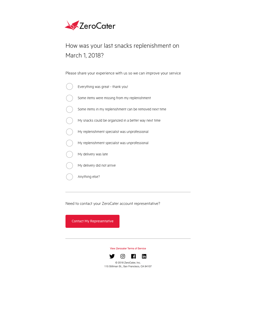
Variation A: Multiple Choice
Traditional radio button approach with clear categorical options
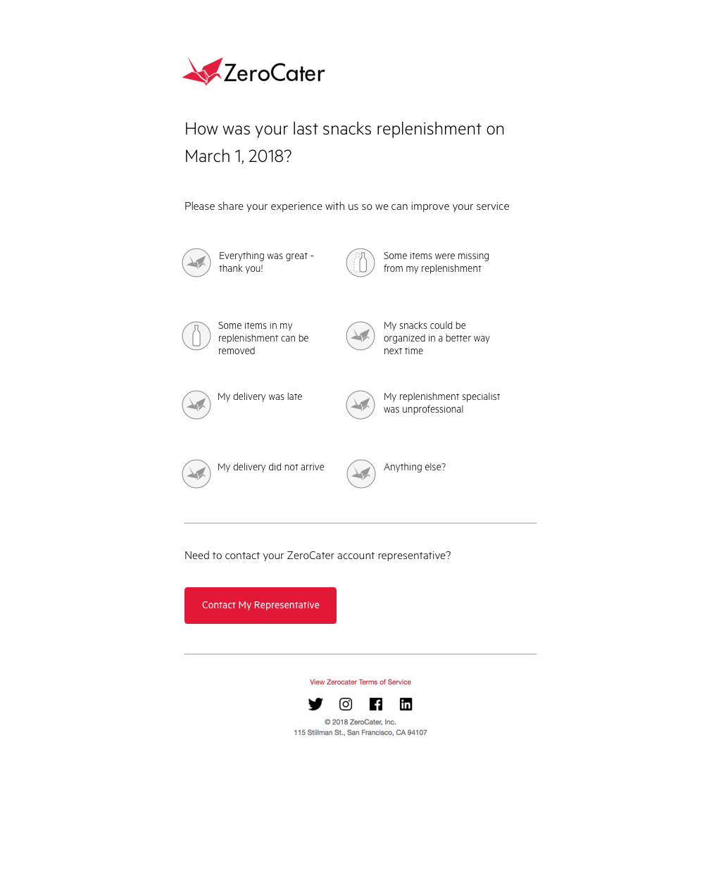
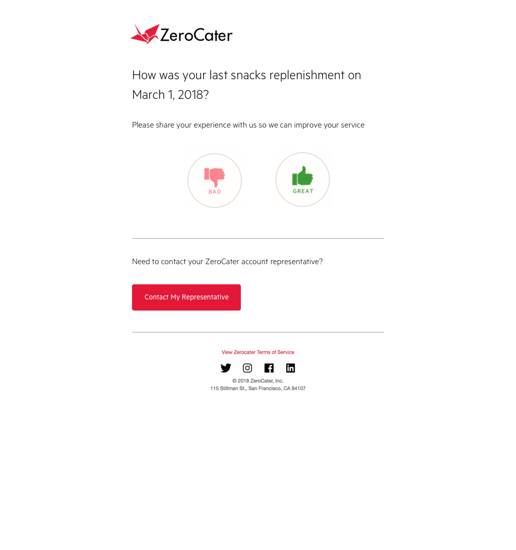
Variation B: Icon-Based
Visual feedback using emoji/icon system for quick emotional response
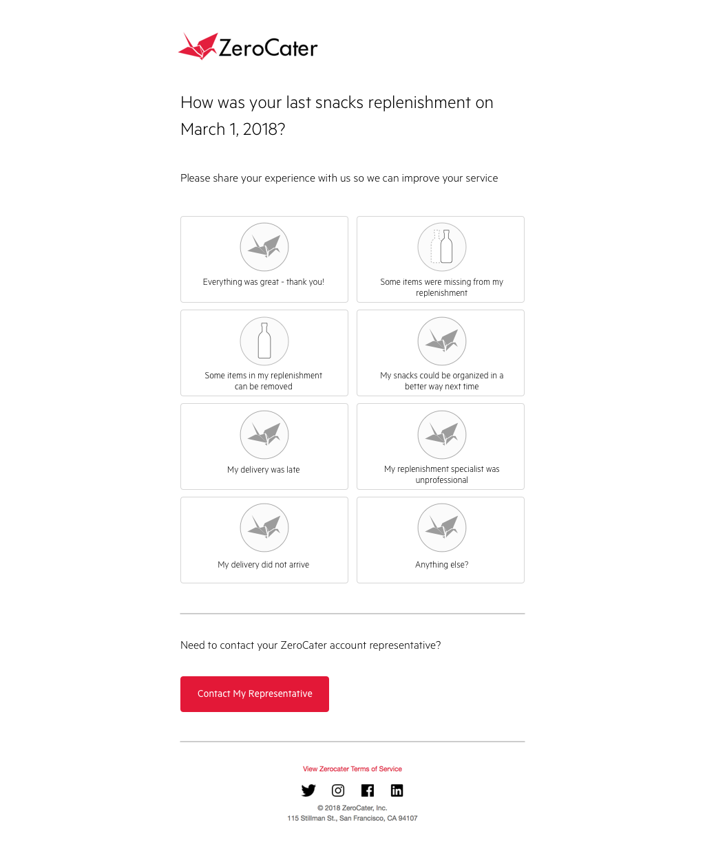
Variation C: Card Layout
Card-based selection with more visual hierarchy and space
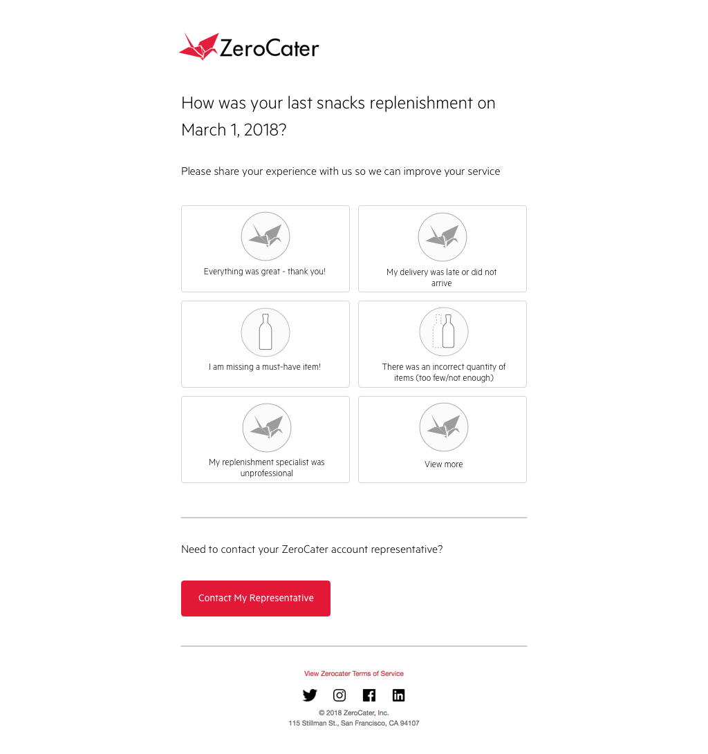
Variation D: Enhanced Cards
Refined card approach with improved typography and spacing
Variation E: Minimal
Simplified approach focusing on core feedback collection
Testing Results & Component Decision
Winner: Icon-Based (Variation B)
- • 34% higher completion rate
- • 2.3x faster user interaction
- • Universal visual language
Key Insights
- • Visual feedback reduces cognitive load
- • Emoji transcends language barriers
- • Mobile-first approach wins
Design System Impact
- • Icon-based feedback became standard
- • Influenced rating components
- • Adopted across all products
Transformative Business Impact
The design system became the foundation that enabled ZeroCater to scale from a scrappy startup to a comprehensive enterprise platform. It transformed how our team shipped products, maintained quality at scale, and established the systematic approach that influenced the entire organization's design culture.
Engineering Team Impact
"The design system completely transformed our development process. We went from reinventing UI patterns for every feature to having a reliable foundation that let us focus on solving food service challenges."Frontend Engineering Team
Business Growth Enabler
"The design system was crucial to our ability to scale. As we grew from serving hundreds to thousands of companies, the consistent experience became our competitive advantage."ZeroCater Leadership Team
Key Learnings & Design System Legacy
What Made It Successful
- • Designer-developer hybrid: Direct implementation eliminated hand-off friction
- • Startup-appropriate scope: Focused on essential patterns rather than comprehensive coverage
- • Progressive enhancement: Started with foundational elements and grew organically
- • Cross-platform thinking: Designed patterns that worked across web, mobile, and email
Long-term Impact
- • Cultural foundation: Established systematic design thinking across the organization
- • Scalability enabler: Made rapid growth possible without sacrificing quality
- • Industry influence: Early example of startup-scale design system implementation
- • Career evolution: Demonstrated the value of design-development hybrid roles