Spotlights Reporting at Betterview
Creating an intuitive interface for converting interactive data into structured reports for insurance professionals.
Overview
Betterview, an online platform providing actionable insights on property risk aimed at insurance professionals, offered valuable property risk insights but lacked a means for insurance professionals to export this data in a comprehensive format.
As the principal designer and a new member of the product team, it was my responsibility to design a feature that could bridge this gap, directly impacting the work of thousands of insurance professionals.
My Contribution
- • Product Design
- • UI & UX Design
- • User Research
The Team
- • 1x Designer (Myself)
- • 1x Product Manager
- • 2x Engineers
Process
Collaborating closely with a team of engineers, I tackled the challenge of transforming Betterview's dynamic visual data into a static, exportable format. This required integrating complex mapping tools with third-party data and crafting a design that would accommodate both PDF and .CSV outputs.
Client Challenges
- • No exportable map data
- • Incomplete Reporting
Engineering Challenges
- • Map tool unable to export text data
- • Data from map tool not automatic
Research & Discovery
Research on Past Limitations
I investigated previous challenges that prevented the inclusion of an exportable feature, gaining insights into potential solutions and understanding feasibility constraints.
User Research & Analysis
I initiated the project by diving into a comprehensive user research phase, conducting interviews with internal teams to grasp the nuanced challenges faced by our clients. This was coupled with an in-depth analysis of previous limitations, which provided a historical context and helped in identifying viable pathways for our solution.
Interviews with Internal Team
I conducted interviews with Betterview's Client Success team and key Account Executives to understand the pain points related to the lack of exportable Spotlights data.
Technical & Design Synthesis
Drawing from the insights gained, I engaged in a series of technical interviews, gathering key input that informed our iterative prototyping process. The design requirements were then defined, balancing the need for both web and print accessibility, ensuring that our solutions were not only technically feasible but also aligned with our users' workflows.
Users Interviewed
- • Over 100 (Via Online Survey)
- • 20 (In Person, Over Video Call)
Technical Interviews
I spoke with Engineering team members to gather technical perspectives and direction for addressing the challenges.
Exploration of Engineering Solutions
I worked on creating a layout that did not rely solely on color to convey information, ensuring legibility and creating a key or legend for the static map visualization.
Many conversations with both the Engineering and Data teams were necessary.
Solution Development
The actual development of the solution involved rapid sketching and exploration of various engineering possibilities. This phase was critical in translating the dynamic image mapping into a static format without losing the essence of our interactive tools. The result was a design that did not rely solely on color, incorporating a clear legend that maintained the legibility of our data in a printable format.
Skills Used
- • Sketch App for Prototyping
- • Hand-Drawn Explorations
- • Front-End Development
Process
- • Initial Sketching
- • Prototyping in Sketch App
- • Assist with implementation
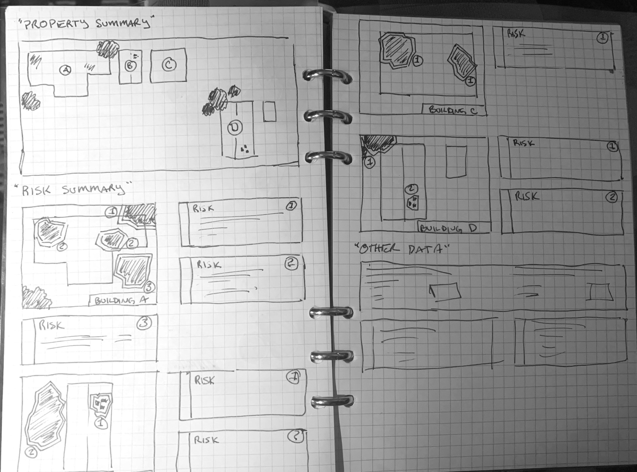
Initial Sketching
Utilized pen-and-paper sketches to quickly communicate potential solutions and gain stakeholder buy-in.
Initial Sketches for Stakeholder Buy-In
Prototyping in Sketch App
Collaborated with engineers to brainstorm and prototype solutions, considering both design and technical constraints.
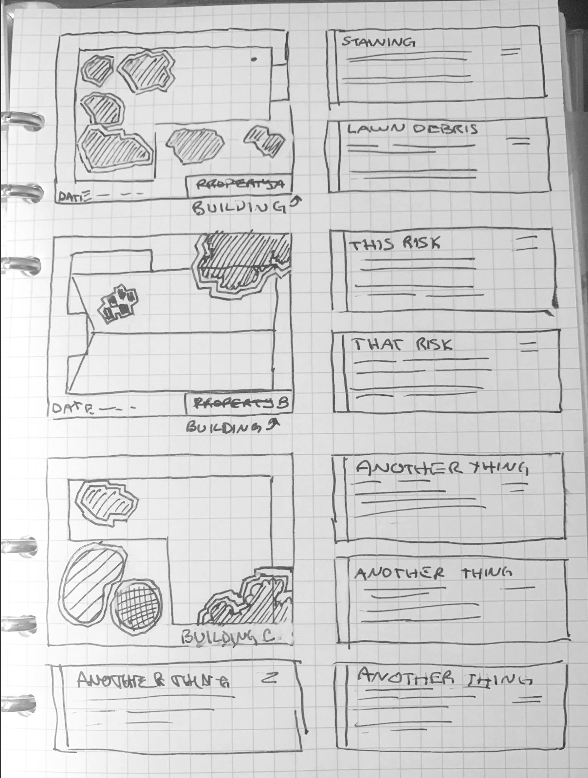
Prototypes created in Sketch App were developed into high-resolution mockups that were used to communicate our solutions and to give the Engineering team a template to work from when they began developing the final product.
High-resolution mockups created in Sketch App

Additional prototype explorations and design iterations

Design development process and refinements
Solving for Accessibility Issues
Worked with engineering to find practical ways to translate the datapoints provided by Betterview's dynamic, interactive mapping tool into a legible, static report. New labeling was required in the form of keys or legends printed next to the imagery that they are analyzing.
Solution
- • High-contrast colors
- • Variegated outlines
- • Static mapping images
Issues
- • Lack of contrast
- • Lack of legibility
- • Limited printing options
Exploring Engineering Solutions for Legibility
Visual solutions for representing graphic data were explored. Their colorful nature lead the product team to name them Spotlights.
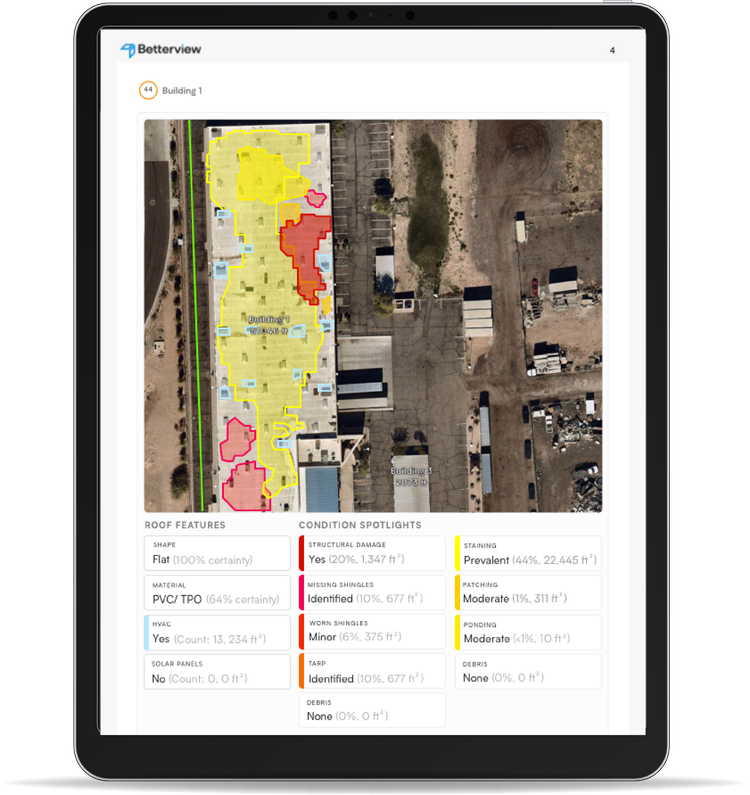
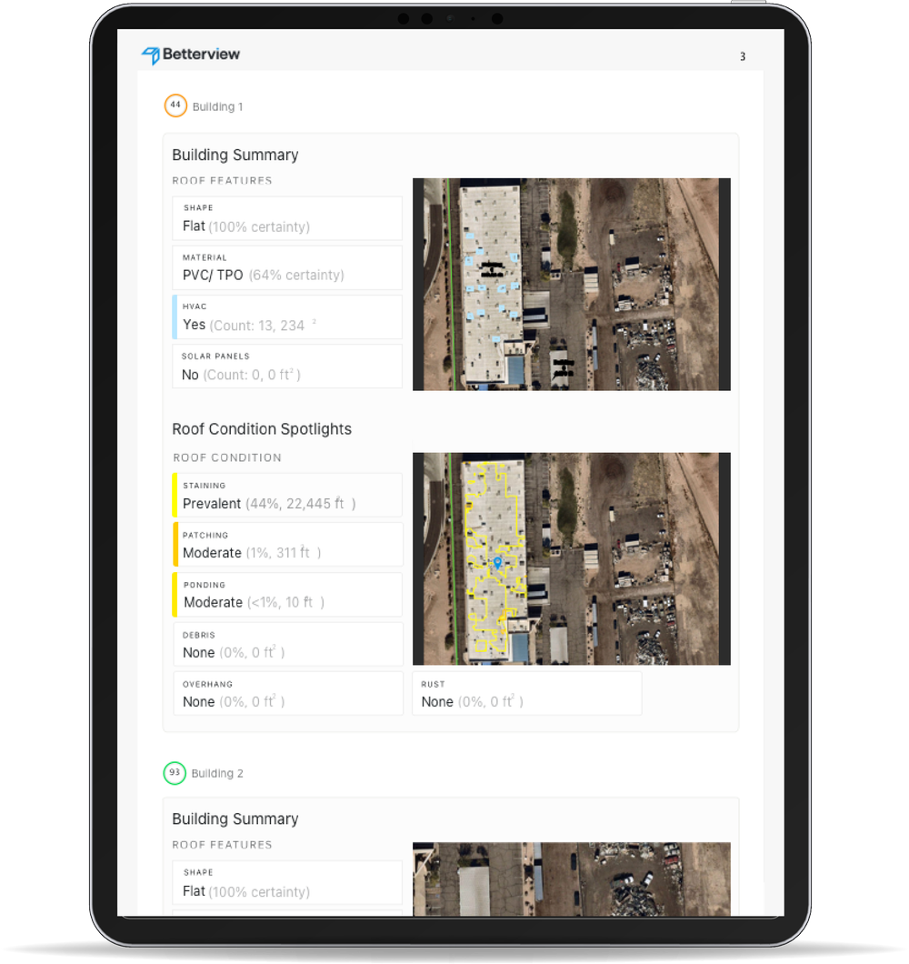
Creating a Key, or Legend for the map data makes the information easy to scan and understand. Because of the multi-layered nature of visual data within the Betterview Platform, the datapoints found in the mapping tool were turned into multiple static images featuring colorful flags to communicate hazard details.
Results
The Spotlights Reporting feature was successfully implemented, profoundly enhancing the platform's functionality and user experience. The feature now allows for a complete property risk profile to be exported, including the previously interactive map's visual insights. This pivotal improvement has streamlined the workflow for Betterview's clients, such as underwriters at Nationwide and State Farm, enabling them to leverage comprehensive reports for informed decision-making. The feature's launch was met with positive feedback, affirming its impact on the company's service offering.
Outcome
- • Pivotal Improvement
- • Positive User Feedback
- • Comprehensive Reporting
- • Higher Value for Platform
Audience
- • State Farm Employees
- • Nationwide Employees
- • Underwriters
- • Contractors
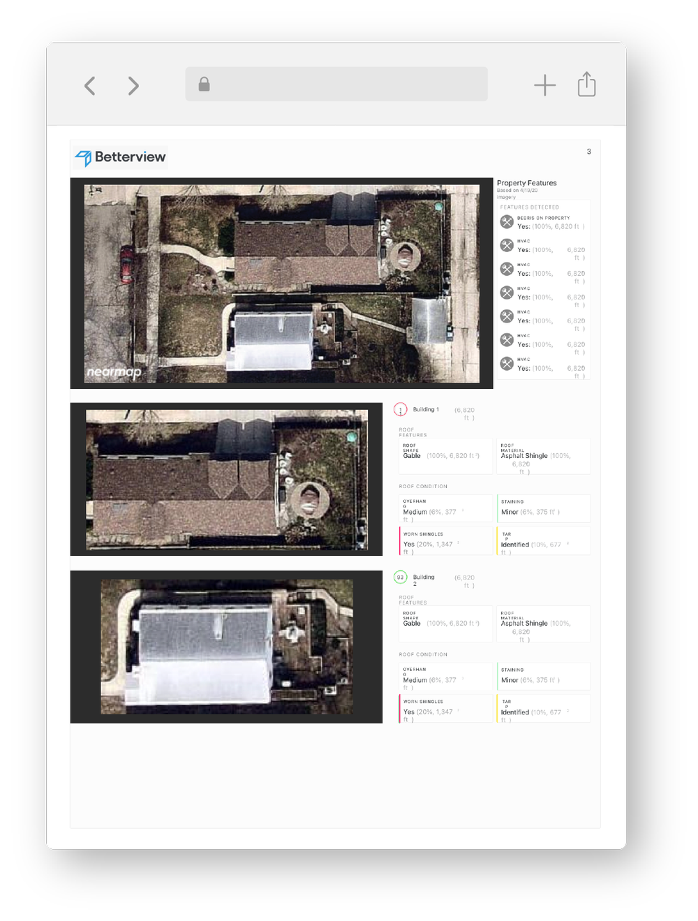
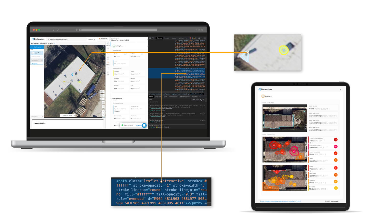
Converting dynamic maps into static datapoints within an exportable report.
@2x.png)
All image related datapoints are now expressed in the form of static images that feature visual flags to communicate the dynamic data conveyed in the interactive map tools housed on the Betterview platform.

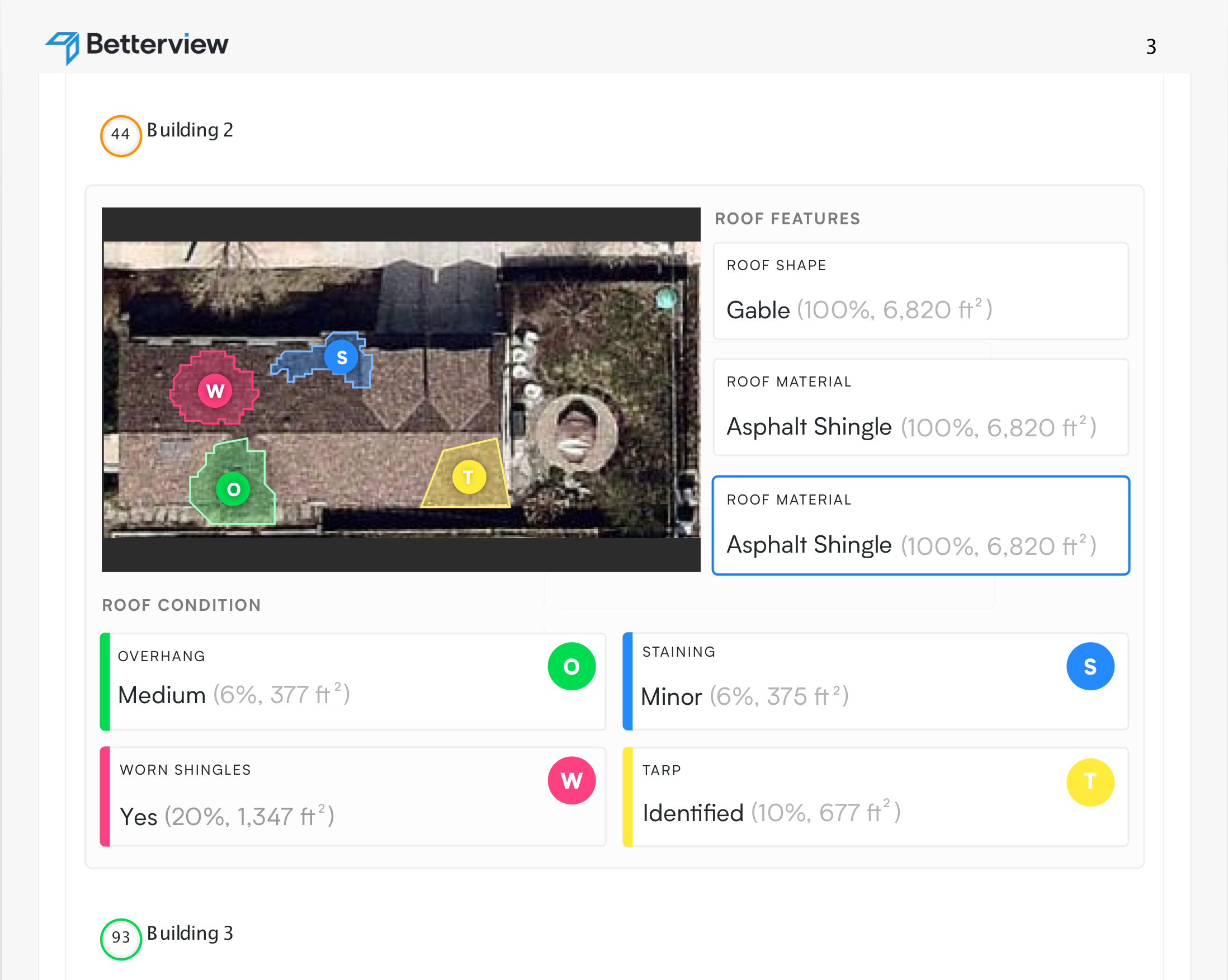
An exported page from the new Spotlight Reporting feature, featuring map information that was previously unavailable for export.
Reducing complex map imagery to static Spotlight Reports shows in-depth hazard information in an easy-to-scan format.
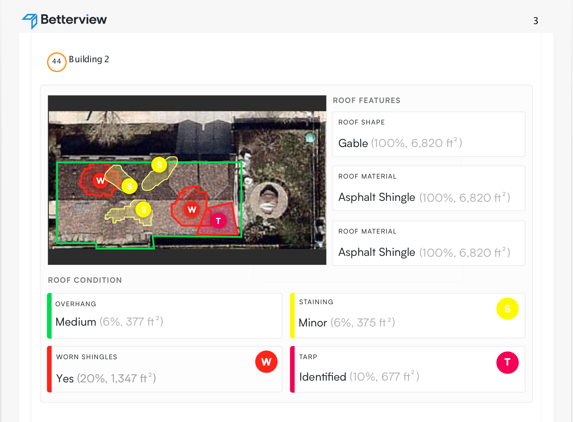
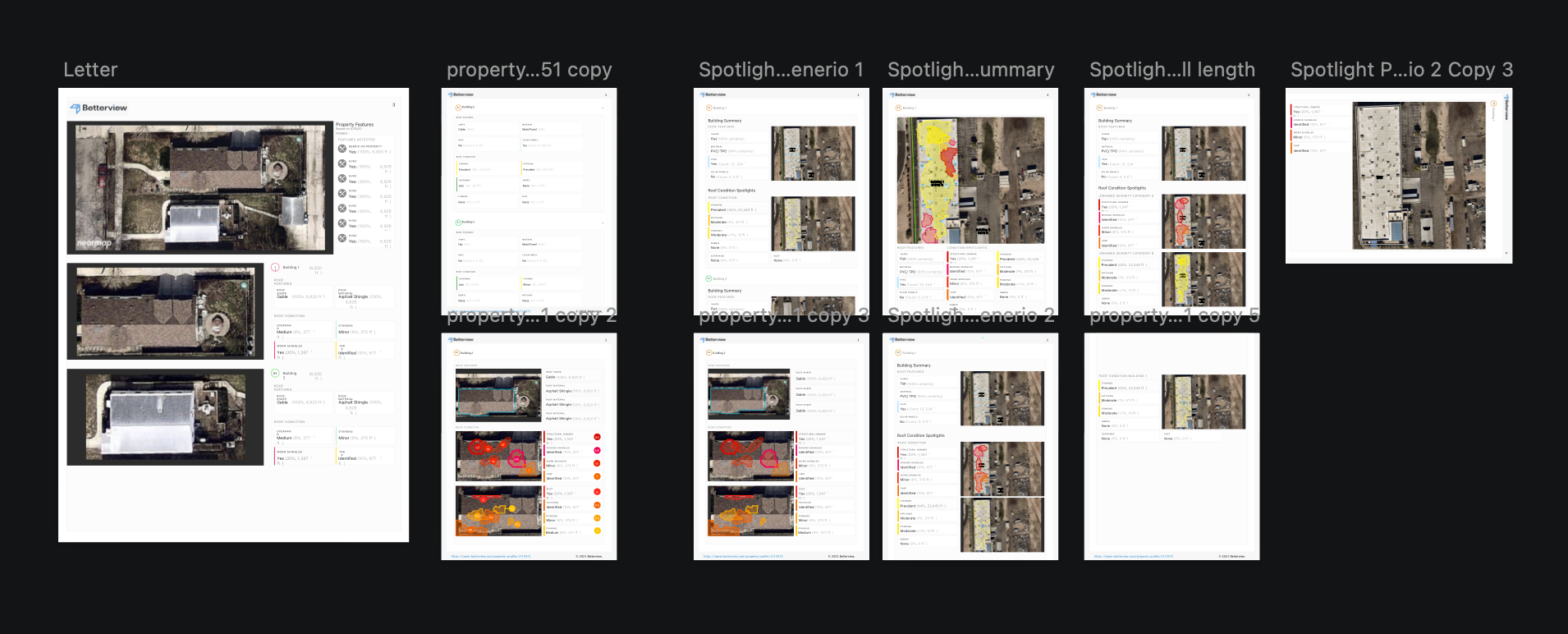
Additional examples of the implemented Spotlights Reporting feature
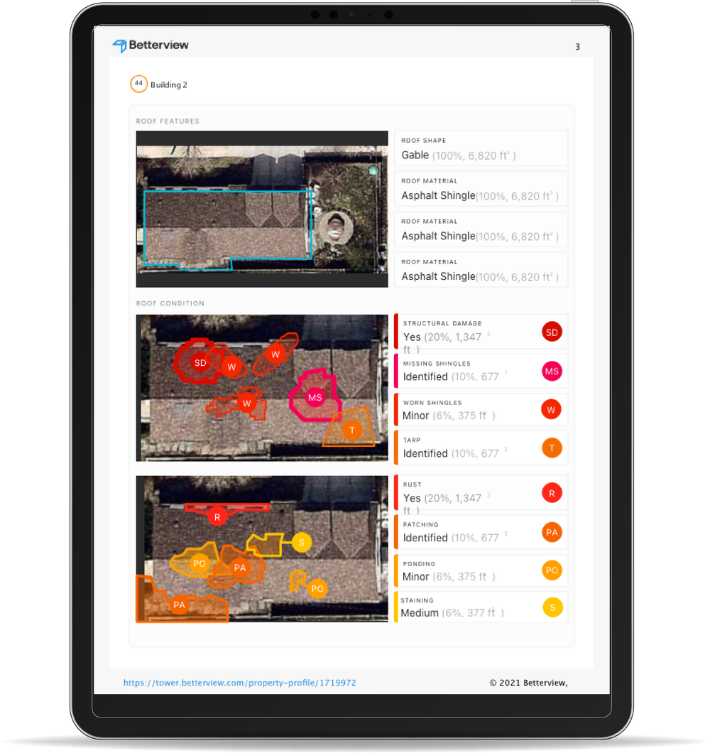
Final implementation showcasing the complete reporting functionality
@2x.png)
Supporting design system elements and components
.png)
Alternative design exploration and iteration process